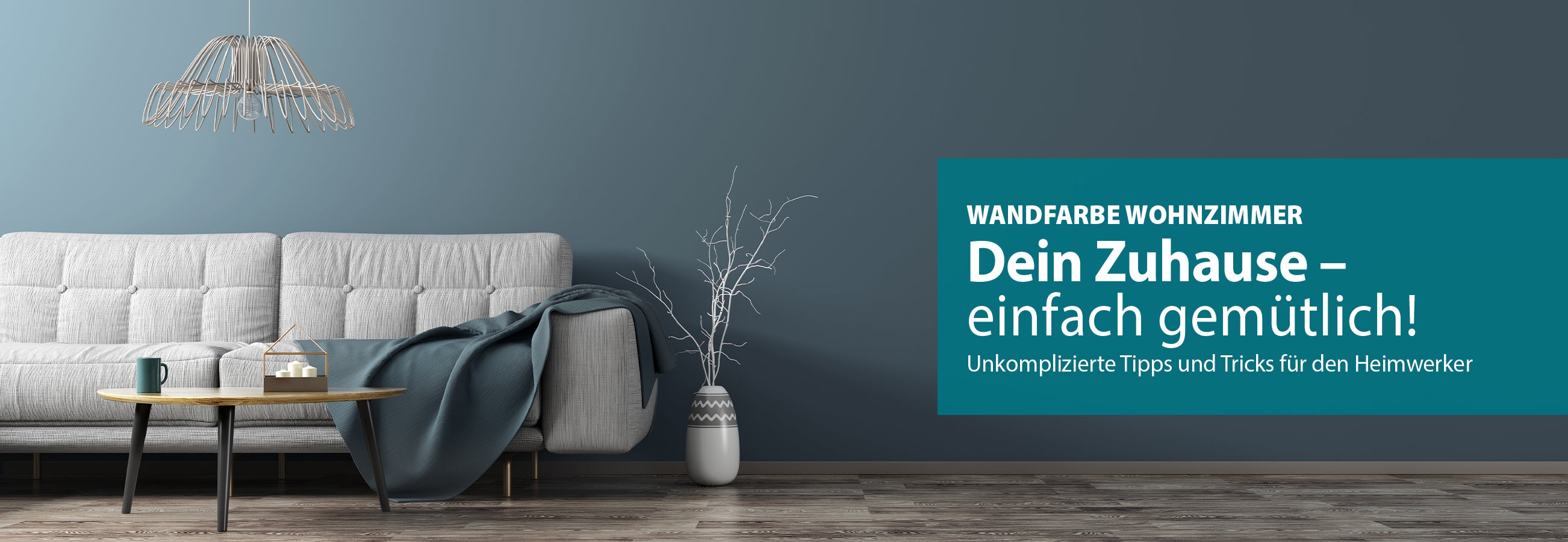
Wandfarbe Wohnzimmer
Inhalt
Wandfarbe Wohnzimmer: Tipps, Trends & Ideen
Das Wohnzimmer ist das Herzstück unseres Zuhauses. Hier genießen wir Zeit mit der Familie, entspannen bei einem guten Buch oder schauen einen spannenden Film. Damit dieser Ort zu Deiner persönlichen Krafttankstelle wird, ist die richtige Atmosphäre das A und O. Neben der Inneneinrichtung mit Möbeln und Accessoires ist die Wohnzimmer Wandfarbe dafür entscheidend. Die Wandgestaltung mit ausgewählten Farben und Tapeten sorgt für unterschiedliche Stimmungen im Raum.
Hier erfährst Du, welche Farbnuancen wie wirken, welche Kontraste Du zaubern kannst, was die neuesten Trends sind und wie Dir die Farblehre bei der Entscheidung helfen kann. Außerdem geben wir Dir Farbtipps und Farbvorschläge an die Hand, die Dein Wohnzimmer in eine Wohlfühloase verwandeln.
Wandfarbe im Wohnzimmer: Hell oder dunkel?
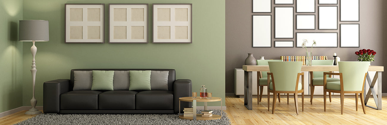
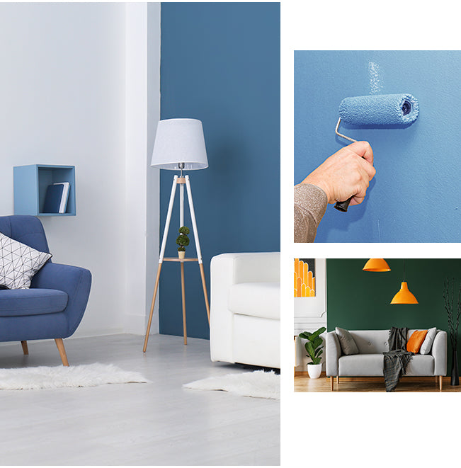
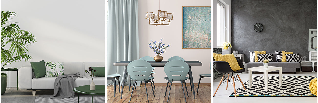
Die Wahl der Wandfarbe fürs Wohnzimmer kann zu einer echten Herausforderung werden. Es ist zu bedenken, dass jeder Ton in einem Raum ein ganz eigenes Ambiente schafft. Ob Akzente oder das Streichen der ganzen Wand im Wohnzimmer, Farben und Kontraste beeinflussen die Raumwahrnehmung und haben sogar Einfluss auf unsere Stimmung. Helle Farben wie Weiß, Grau oder Pastelltöne lassen Räume optisch größer wirken und schaffen eine einladende Atmosphäre. Sie sind ideal für kleine Wohnzimmer oder wenn Du einen frischen und luftigen Eindruck erzielen möchtest. Dunklere Farbtöne wie Braun, Dunkelgrün oder Violett erzeugen hingegen eine behagliche und dramatische Stimmung. Für die Wandgestaltung ist es wichtig, nicht zu viel Wandfläche zu streichen und die Decke immer hell zu halten. Generell sollten dunkle Farbtöne nur bei ohnehin hellen, lichtdurchfluteten Räumen mit großen Fenstern verwendet werden, da sie viel Licht absorbieren und Räume optisch kleiner wirken lassen. In dunklen oder kleinen Räumen können sie schnell erdrückend wirken und eine düstere Atmosphäre schaffen.
Der Farbkreis als Entscheidungshilfe
Die Farblehre bietet eine gute Orientierung bei der Farbwahl. Komplementärfarben (z.B. Rot und Grün) erzeugen starke Kontraste und können für lebendige Akzente sorgen. Harmonische Kombinationen erhältst du, indem Du Farben wählst, die nebeneinander im Farbkreis liegen (z.B. Blau und Grün). Beachte auch die Wirkung von warmen (Rot, Orange, Gelb) und kalten Farbtönen (Blau, Grün, Violett). Warme Farben machen Räume gemütlicher, während kalte Farben eher beruhigend wirken. Diese Faktoren solltest Du bei der Wandgestaltung zusätzlich beachten:
- Muster: Mustertapeten oder Wandbilder können für interessante Akzente sorgen.
- Licht: Die Wandfarbe im Wohnzimmer beeinflusst, wie das Licht im Raum reflektiert wird.
- Möbel: Die Möbel sollten farblich zur Wand passen.
- Textilien: Kissen, Decken und Vorhänge können die Farbgestaltung abrunden.
- Himmelsrichtung: Je nachdem, ob Dein Wohnzimmer nach Norden, Süden, Osten oder Westen ausgerichtet ist, solltest Du unterschiedliche Farbtöne wählen, um die Lichtverhältnisse optimal auszunutzen.
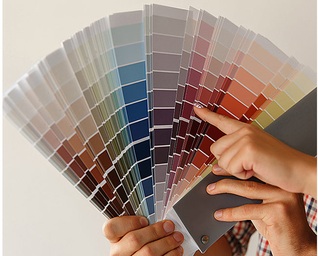
Tipp: Wenn Du Dir unsicher bist, kannst Du Dein Wohnzimmer vorab bemustern! Erstelle ein mindestens 60x80 cm großes Farbfeld, hänge es an die Wand und beobachte es zu unterschiedlichen Tageszeiten bei verschiedenen Lichtverhältnissen.
Wohnzimmer Wandfarbe:
Welche Farben sind im Trend?
Grau bietet nicht nur ein breites Spektrum an unterschiedlichen Nuancen, sondern lässt Räume einladend, offen und klar erscheinen. Die Nichtfarbe setzt andere Farbtöne gekonnt in Szene, kann aber auch alleine an der Wand in Räumen für Eleganz sorgen. Möbel aus Holz oder weitere Grauabstufungen akzentuiert gesetzt, schaffen eine moderne Optik in Ihrem Wohnzimmer.
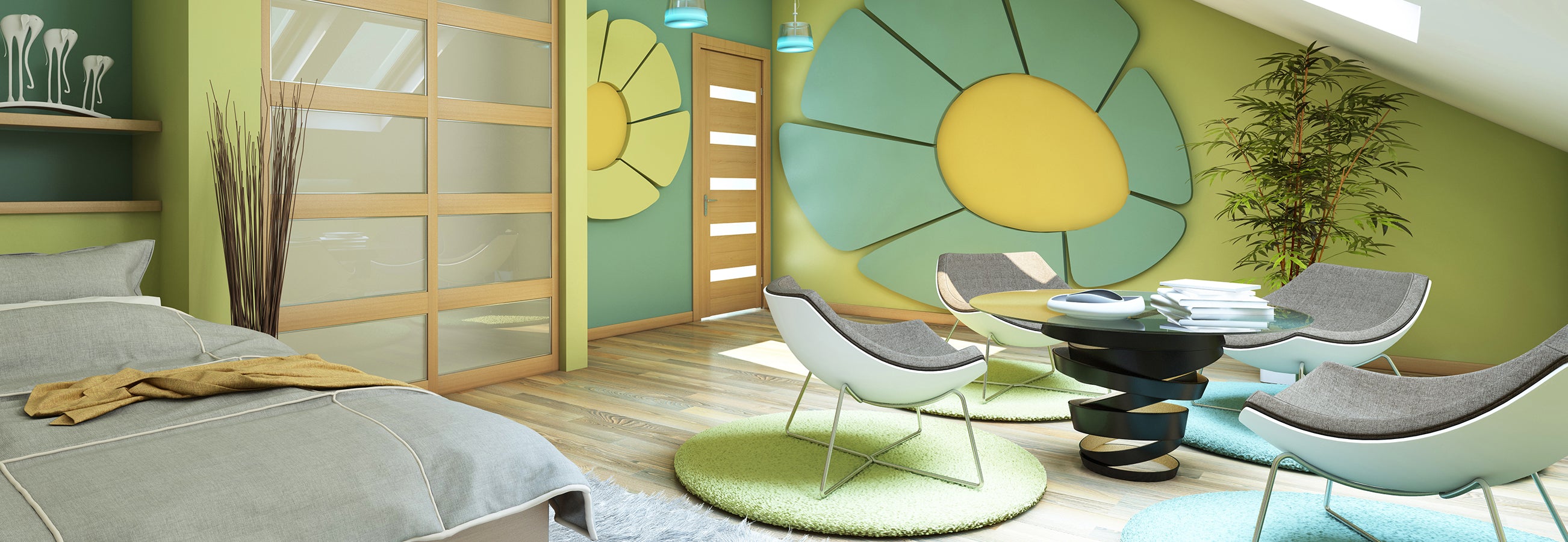
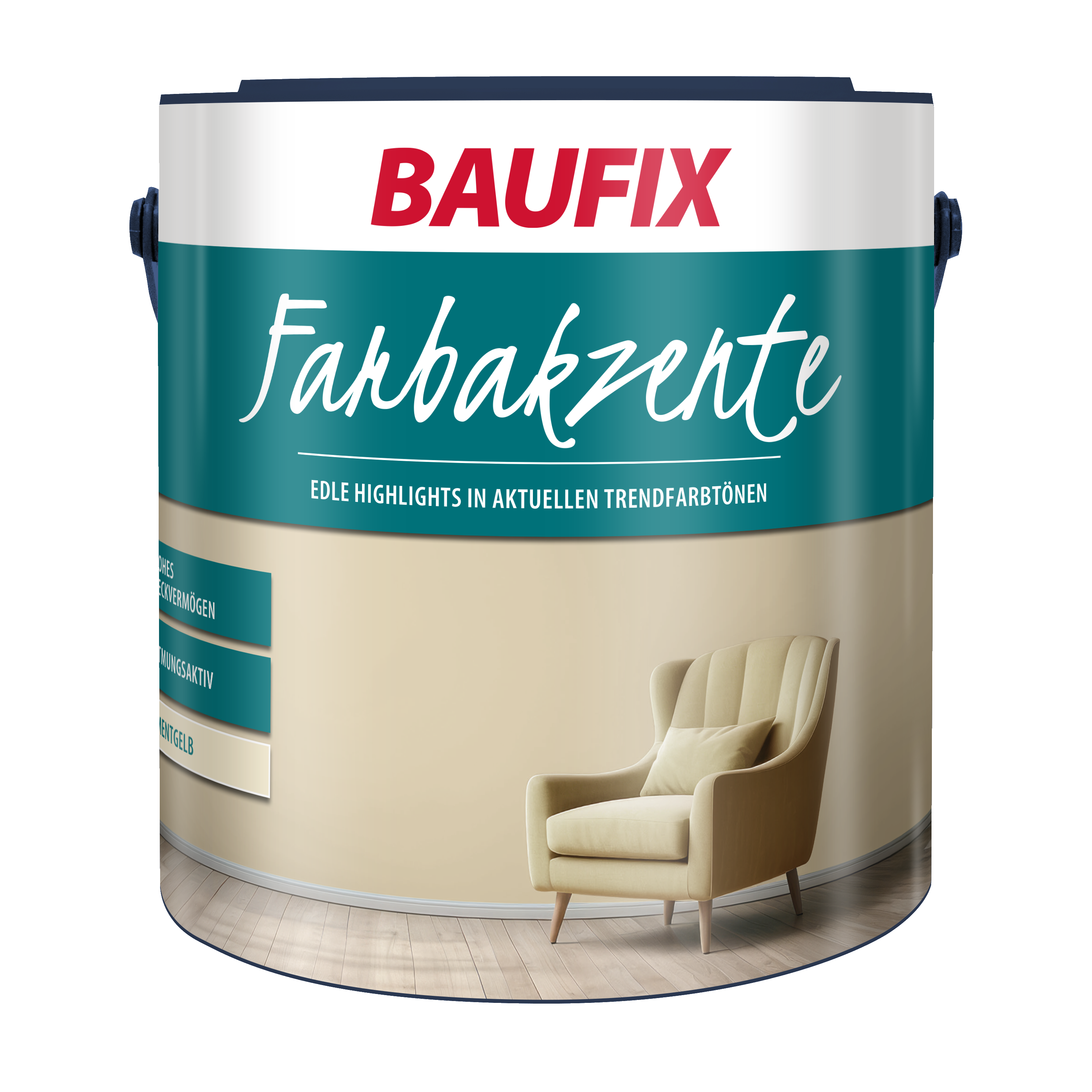
Gelbtönen werden die Eigenschaften anregend, kreativ, heiter und stimulierend nachgesagt. Nicht umsonst assoziieren wir den Farbton mit Leichtigkeit und Sonne. Mit kräftigen Gelbnuancen setzt Du echte Hingucker im Wohnzimmer, während abgetönte Varianten sich etwas zurückhaltender präsentieren. Auch die Kombinationsmöglichkeit mit zum Beispiel Grau mildert den Effekt. Gelbtöne eignen sich als Wandfarbe für Wohnzimmer mit wenig Tageslicht oder sogar als Deckenfarbe. Wer im Wohnzimmer seinen Arbeitsbereich eingerichtet hat, profitiert von der aktivierende und kreativen Wirkung.
Ob Salbeigrün, Türkis, Rasedagrün oder Tannengrün – Grüntöne an den Wänden strahlen Ruhe aus. Der natürliche Effekt wird dabei durch eine Einrichtung aus Holz und Zimmerpflanzen ergänzt. Auch Accessoires in Blautönen wirken dazu beruhigend. Wenn Du eine zusätzliche Wandfarbe zu Grünnuancen kombinierst, solltest Du auf die gleiche Farbfamilie zurückgreifen oder auf Beige-, Brauntöne oder Hellgrau setzen.
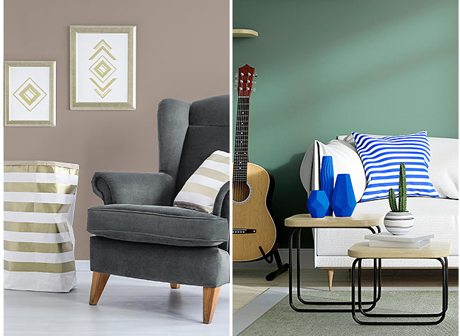
Rote Akzentwände haben die Eigenschaft, besonders belebend und energetisierend zu wirken, sollten jedoch eher sparsam verwendet werden, wenn Du in Deinem Wohnzimmer und gleichzeitigem Wohnraum eine ruhige und entspannte Atmosphäre schaffen möchtest. Orange oder Terrakotta sind eine gute Alternative zu Rottönen, da diese eine wärmere und behaglichere Wandgestaltung ermöglichen. Rot lässt sich mit Grüntönen oder einem Grauton kombinieren, was für Lebendigkeit sorgt. Ein Weinrot an den Wänden ist ausdrucksstark und verleiht dem Raum eine gewisse Eleganz. Partner von intensiven Rottönen können Schwarz oder gar Brauntöne sein. Das Wohnzimmer gewinnt mit dieser Wandfarbe eine gewisse Mystik.
Probier‘s mal mit Gemütlichkeit – das Motto aus dem bekannten Zeichentrickfilm lässt sich ideal mit Beige oder Greige (eine Mischung aus Grau und Beige) als Wandfarbe an Deinen Wohnzimmerwänden erzeugen. Dabei sind Beige- und Greigetöne perfekte Basistöne und zeigen sich in Kombination mit kräftigen oder zarten Kolorierungen als tolle Ergänzungen. Aber auch alleine für sich schaffen Beigetöne Wohnlichkeit, Geborgenheit und Behaglichkeit. Möbel und Dekoration können akzentuiert in Brauntönen oder Grautönen zum Einsatz kommen.
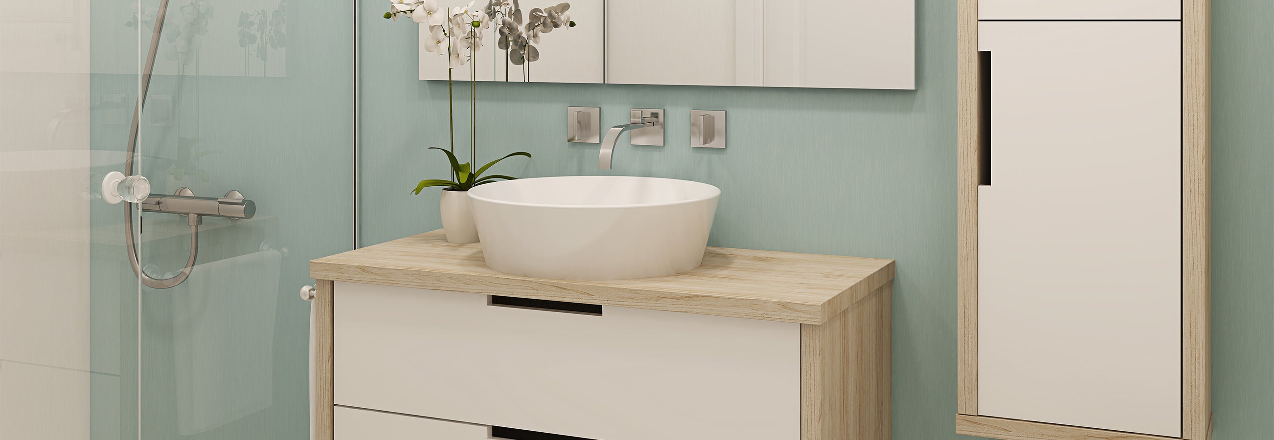
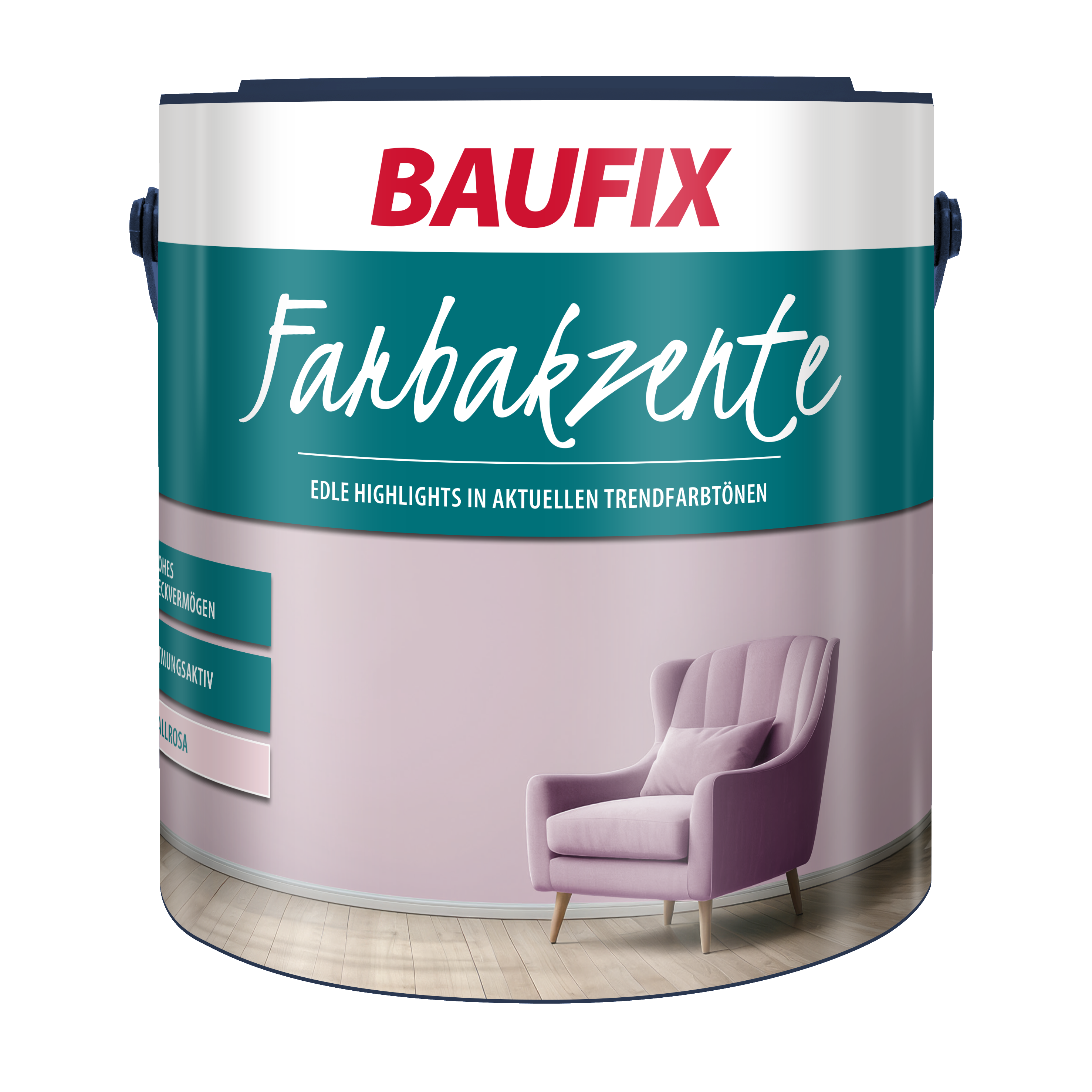
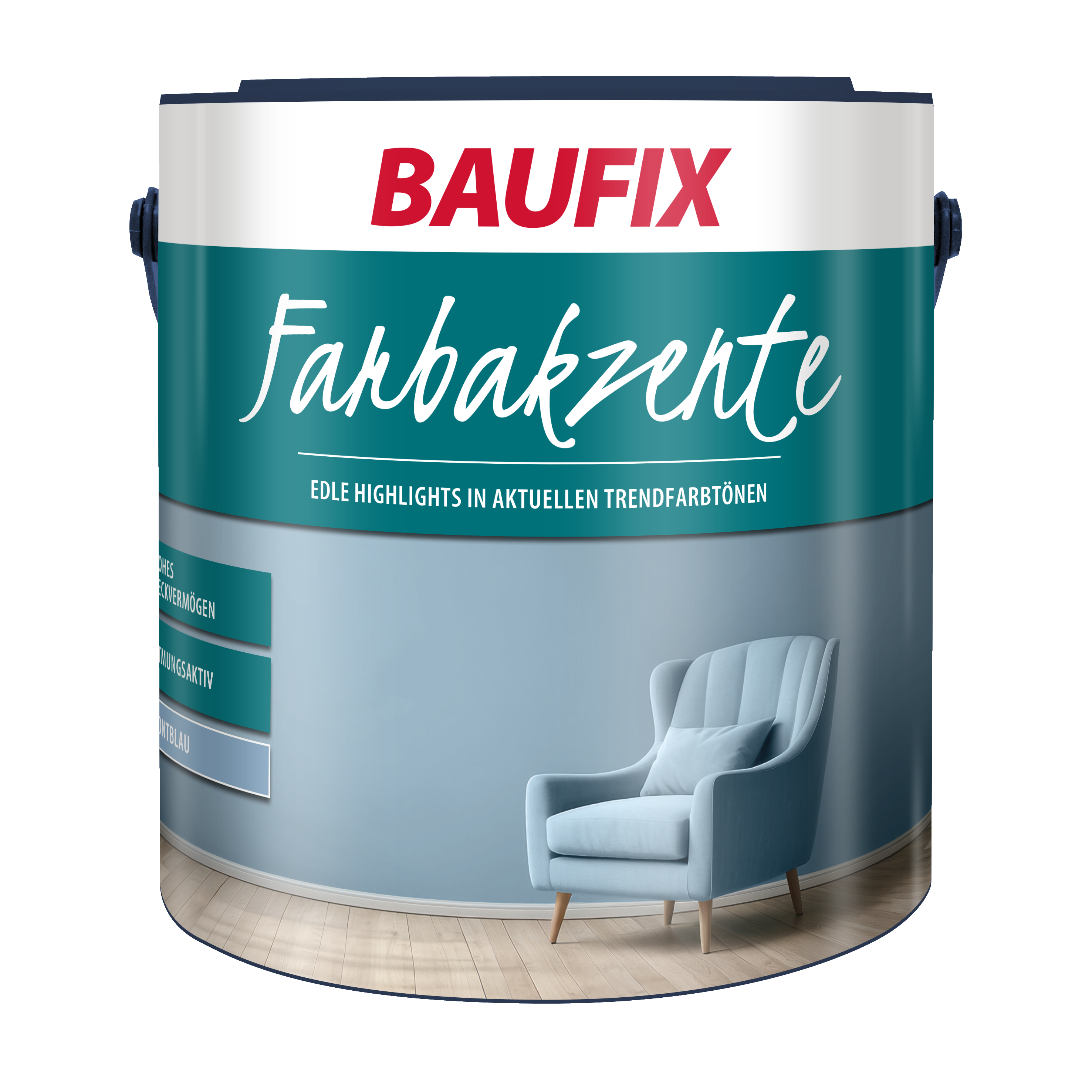
Pastell ist ein echter Allrounder und die Farbpalette als Wandfarbe für das Wohnzimmer ist vielversprechend. Die Nuancen sind die perfekte Wandfarbe für Wohnzimmer mit wenig Tageslicht, kleinen Fenstern oder Möbeln, die sehr dunkel sind. Das Wohnzimmer gewinnt mit diesen hellen Farbnuancen optisch an Weite und bringt eine gewisse Leichtigkeit. Diesen Effekt zaubern abgetönte Trendfarben an den Wohnzimmerwänden durch den sehr hohen Weißanteil. Wenn Dir Reinweiß oder andere Weißtöne zu steril erscheinen, sind Pastellfarben eine gute Alternative. Im Gegensatz zu Rottönen kannst Du die Wandflächen komplett mit der Wandfarbe anstreichen, mit knalligen, akzentuierten Leuchttönen unterstreichen oder mit einer Wandfarbe der gleichen Familie die Wohnzimmerwände verschönern. Pastelltöne sind unter anderem: Mintgrün, Himmelblau, Rosa, Flieder und Pastellgrau.
Unsere Trendfarben für moderne Wohnzimmer
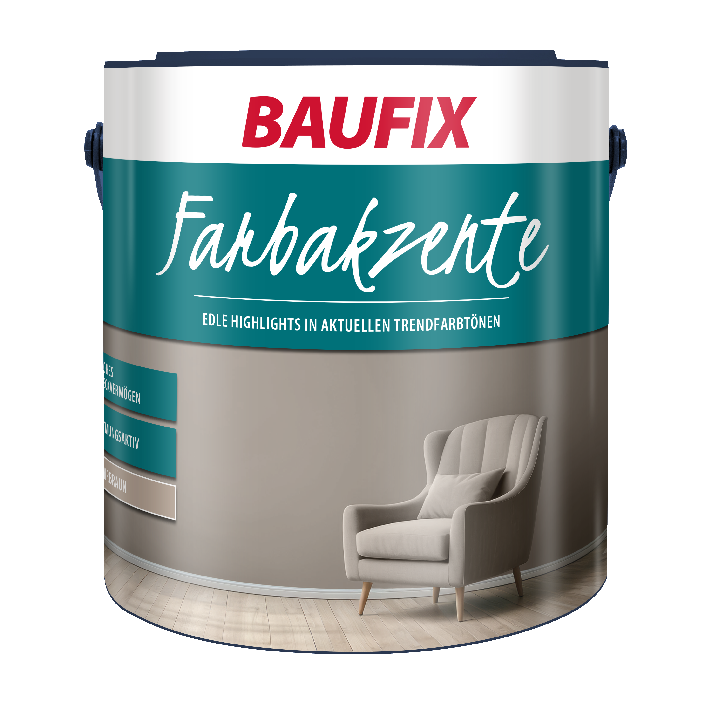
Baufix Farbakzente
Welche Farben wirken freundlich, hell, modern und gemütlich?
Bei der Wandgestaltung wünschen sich viele eine einladende und freundliche Atmosphäre. Bei der Farbgestaltung des Zimmers sollte in dem Fall ein warmer Einrichtungsstil gewählt werden. Gut geeignet sind dazu Orange, warme Rottöne, Beigetöne und Erdtöne. Kräftige Kontraste solltest Du zu diesem Einrichtungsstil nur dosiert, maximal an einer kleinen Fläche, zum Beispiel als Akzentwand oder Wandstreifen, kombinieren. Ruhe und Geborgenheit bringen Blautöne und Grünnuancen. Einen Blick solltest Du zudem auf unterschiedliche Graunuancen werfen. Grau wirkt je nach Helligkeit als Wohnzimmer Wandfarbe besonders effektvoll und den Ideen in Sachen persönlichem Stil im Wohnraum sind keine Grenzen gesetzt. Ein zu empfehlender Farbpartner von Grautönen ist ein zartes Rosa.
Fazit - Wandfarbe im Wohnzimmer
Die Wohnzimmer Wandfarbe sollte ganz Deinem Geschmack entsprechen. Aktuelle Trends und Farbtipps helfen Dir, Dich zu orientieren und einen Einrichtungsstil zu finden, der Deinen Ansprüchen gerecht wird. Daher findest Du bei uns eine große Auswahl an BAUFIX Wandfarben, fürs Wohnzimmer, die sich sowohl für den Erstanstrich als auch für Renovierungsarbeiten eignen. Unser BAUFIX professional Premium Kristallweiß ist der beliebte Klassiker, ist der beliebte Klassiker, überzeugt mit einer hohen Deckkraft und ohne Konservierungsmittel die perfekte Innenfarbe. Moderne Farbanstriche erreichst Du mit unseren BAUFIX Farbakzenten . Spezialfarben für Küche runden unser Sortiment ab. Stöbern Sie durch unsere Auswahl. Wir beraten Dich gerne telefonisch oder per E-Mail.
FAQ
Häufig gestellte Fragen
Warme Erdtöne wie Beige, Braun und Grün schaffen eine gemütliche und harmonische Atmosphäre. Gelb, Orange oder Rot bringen zusätzliche Wärme und Lebendigkeit ins Wohnzimmer.
Grün, als Farbe der Natur, vermittelt ein Gefühl von Ruhe. Sie wirkt ausgleichend auf die Psyche und fördert die Entspannung.
Töne wie tiefes Blau, samtiges Grau oder edles Dunkelgrün verleihen deinen Wänden eine zeitlose Schönheit. Für den modernen Look, kombiniere neutrale Farben wie Weiß oder Beige mit Akzenten in Edelmetallen wie Gold oder Kupfer.
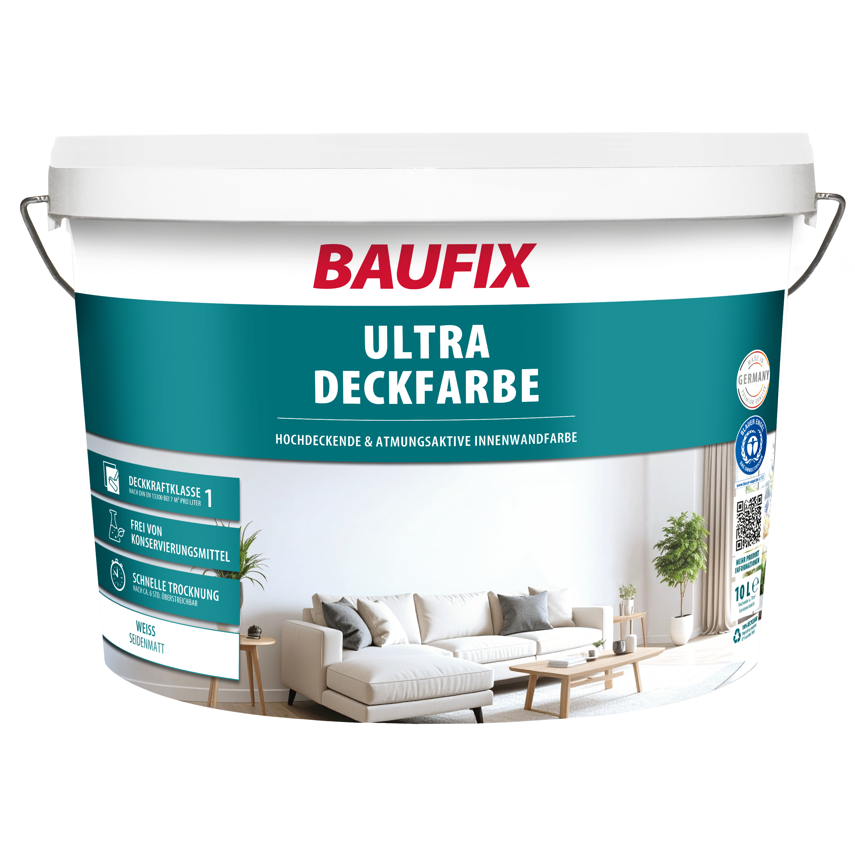
Unsere Wandfarbe: BAUFIX Ultra-Deckfarbe
- Deckfähigkeit Klasse I nach DIN EN 13300 bei 7 m²/l
- Nassabriebbeständigkeit Klasse III nach DIN EN 13300
- perlweiß seidenmatt
- deckt perfekt
- emissionsarm
- für Wände & Decken im Innenbereich
Die beliebtesten Produkte
Unsere Bestseller

Weitere spannende Themen im Ratgeber: