Living room wall paint
Contents
subheading
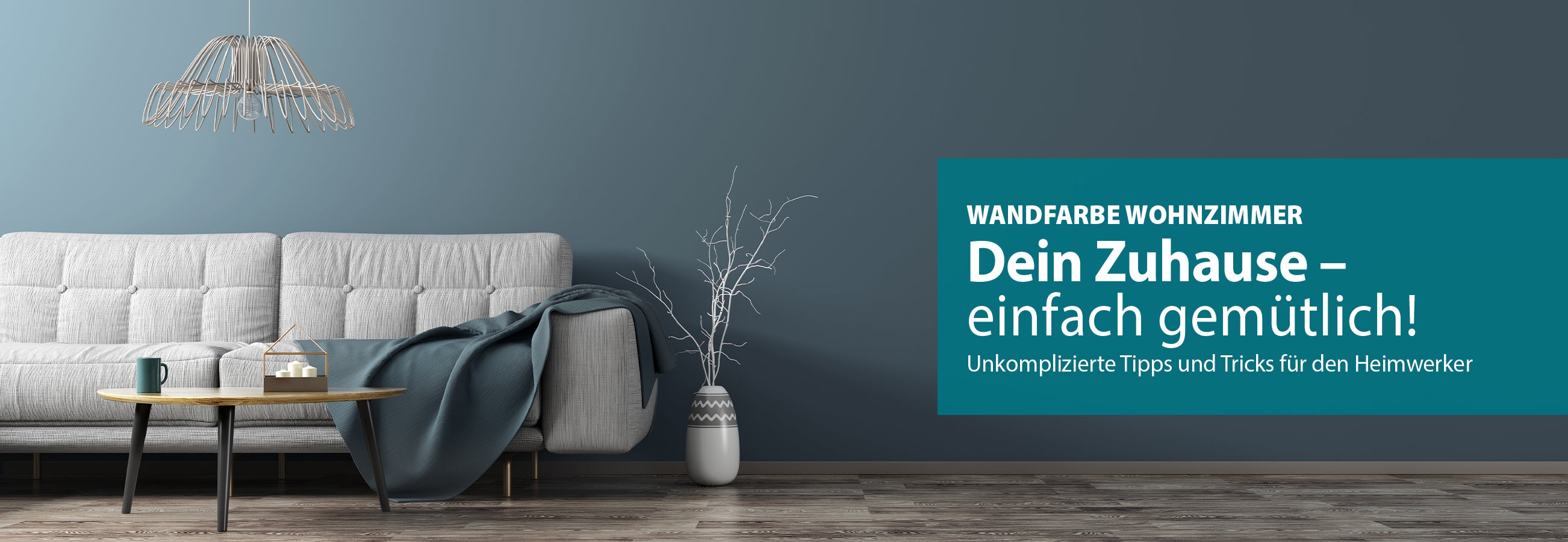
Wall Color Living Room: Tips, Trends & Ideas
Living room wall paint: tips, trends & ideas
The living room is the heart of our home. This is where we enjoy time with the family, relax with a good book or watch an exciting film. To make this place your personal place to recharge your batteries, the right atmosphere is essential. In addition to the interior design with furniture and accessories, the living room wall color is crucial. The wall design with selected colors and wallpaper creates different moods in the room.
Here you will find out which color nuances work in what way, which contrasts you can create, what the latest trends are and how color theory can help you make your decision. We also give you color tips and color suggestions that will transform your living room into an oasis of well-being.
subheading
Wall color in the living room: light or dark?
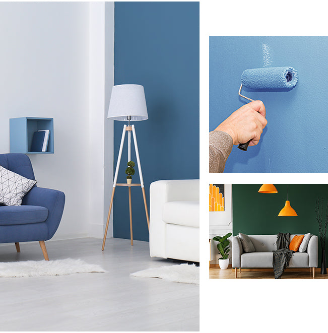
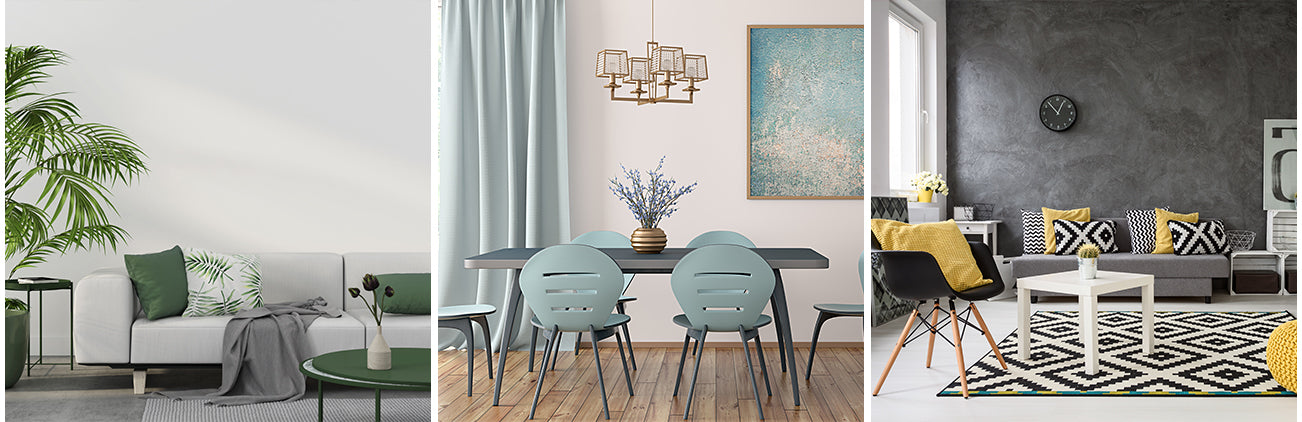
Choosing the wall color for the living room can be a real challenge. It is important to remember that every tone in a room creates its own ambience. Whether accents or painting the entire wall in the living room, colors and contrasts influence the perception of space and even affect our mood. Light colors such as white, gray or pastel shades make rooms appear larger and create an inviting atmosphere. They are ideal for small living rooms or if you want to create a fresh and airy impression. Darker colors such as brown, dark green or purple, on the other hand, create a cozy and dramatic mood. When designing walls, it is important not to paint too much wall space and to always keep the ceiling light. In general, dark colors should only be used in rooms that are already bright and flooded with light and have large windows, as they absorb a lot of light and make rooms appear smaller. In dark or small rooms, they can quickly seem oppressive and create a gloomy atmosphere.
The color wheel as a decision aid
Color theory provides a good guide when choosing colors. Complementary colors (e.g. red and green) create strong contrasts and can be used for vibrant accents. Harmonious combinations are achieved by choosing colors next to each other on the color wheel (e.g. blue and green). Also, consider the effects of warm (red, orange, yellow) and cool tones (blue, green, violet). Warm colors make rooms feel cozier, while cool colors tend to have a calming effect. You should also consider these factors in wall design:
- Pattern: Patterned wallpaper or wall murals can create interesting accents.
- Light: The wall color in the living room affects how light is reflected in the space.
- Furniture: Furniture should match the color of the wall.
- Textiles: Cushions, blankets, and curtains can round off the color scheme.
- Orientation: Depending on whether your living room faces north, south, east, or west, you should choose different shades to make the best use of the available light.
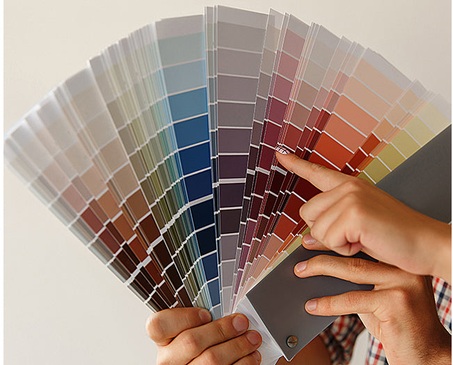
Tip: If you are unsure, you can sample your living room beforehand! Create a color field that is at least 60x80 cm in size, hang it on the wall and observe it at different times of the day under different lighting conditions.
Use this text to share information about your brand with your customers. Describe a product, share announcements, or welcome customers to your store.
FAQ
Living room wall paint:
Which colors are trendy?
Gray not only offers a wide range of different nuances, but also makes rooms appear inviting, open and clear. This non-color skilfully sets off other colors, but can also add elegance to rooms on its own on the wall. Furniture made of wood or other shades of gray accentuated create a modern look in your living room.
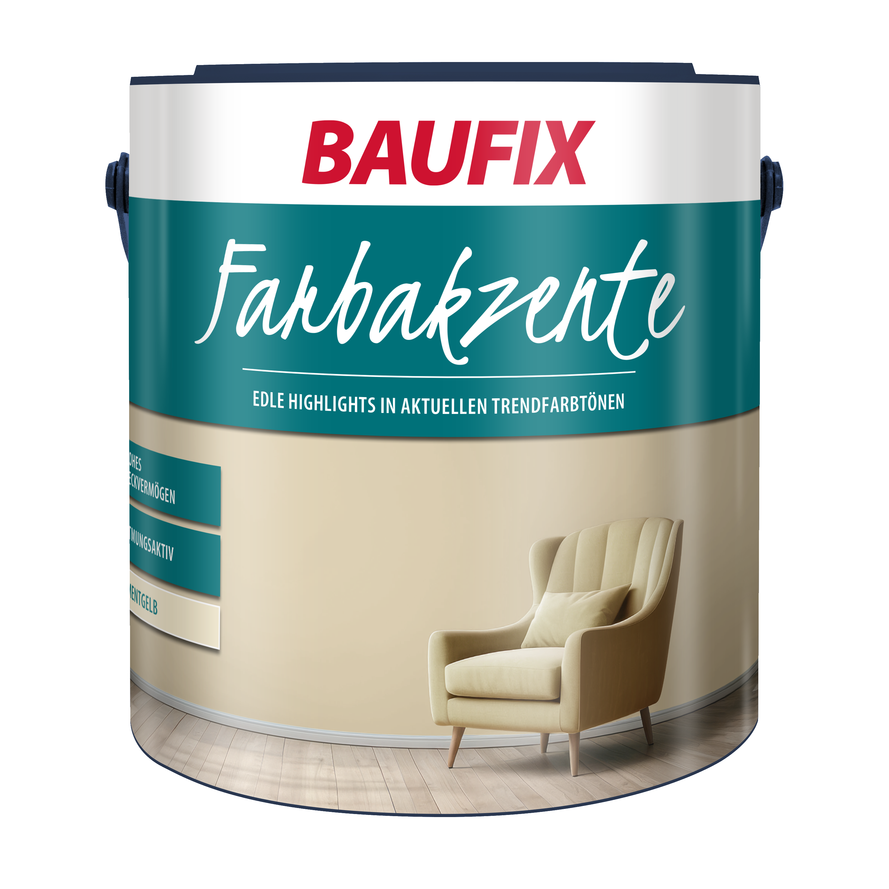
Yellow tones are said to have the properties of stimulating, creative, cheerful and stimulating. It is not for nothing that we associate the color with lightness and sunshine. With strong yellow nuances you can create real eye-catchers in the living room, while toned variants are a little more reserved. The possibility of combining them with gray, for example, also softens the effect. Yellow tones are suitable as a wall color for living rooms with little daylight or even as a ceiling color. Anyone who has set up their work area in the living room benefits from the activating and creative effect.
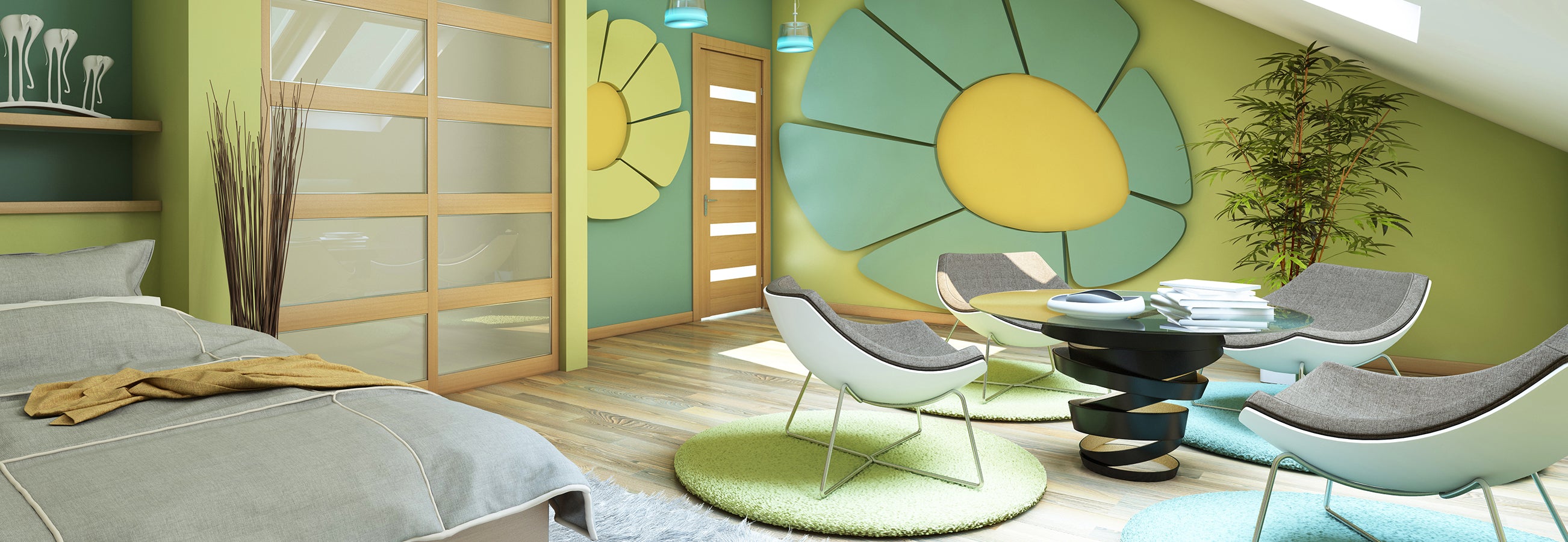
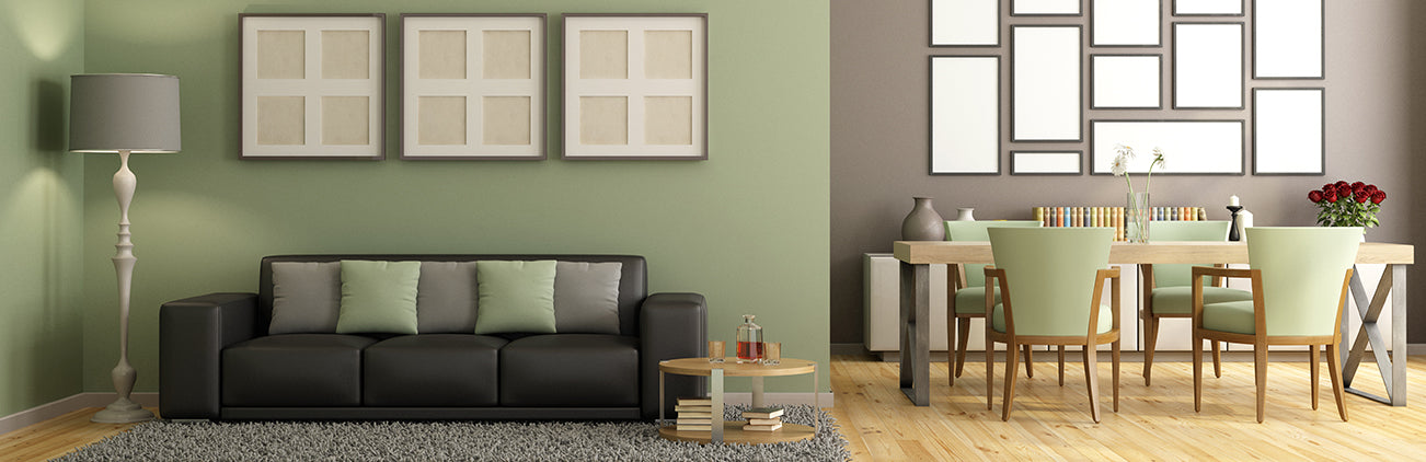
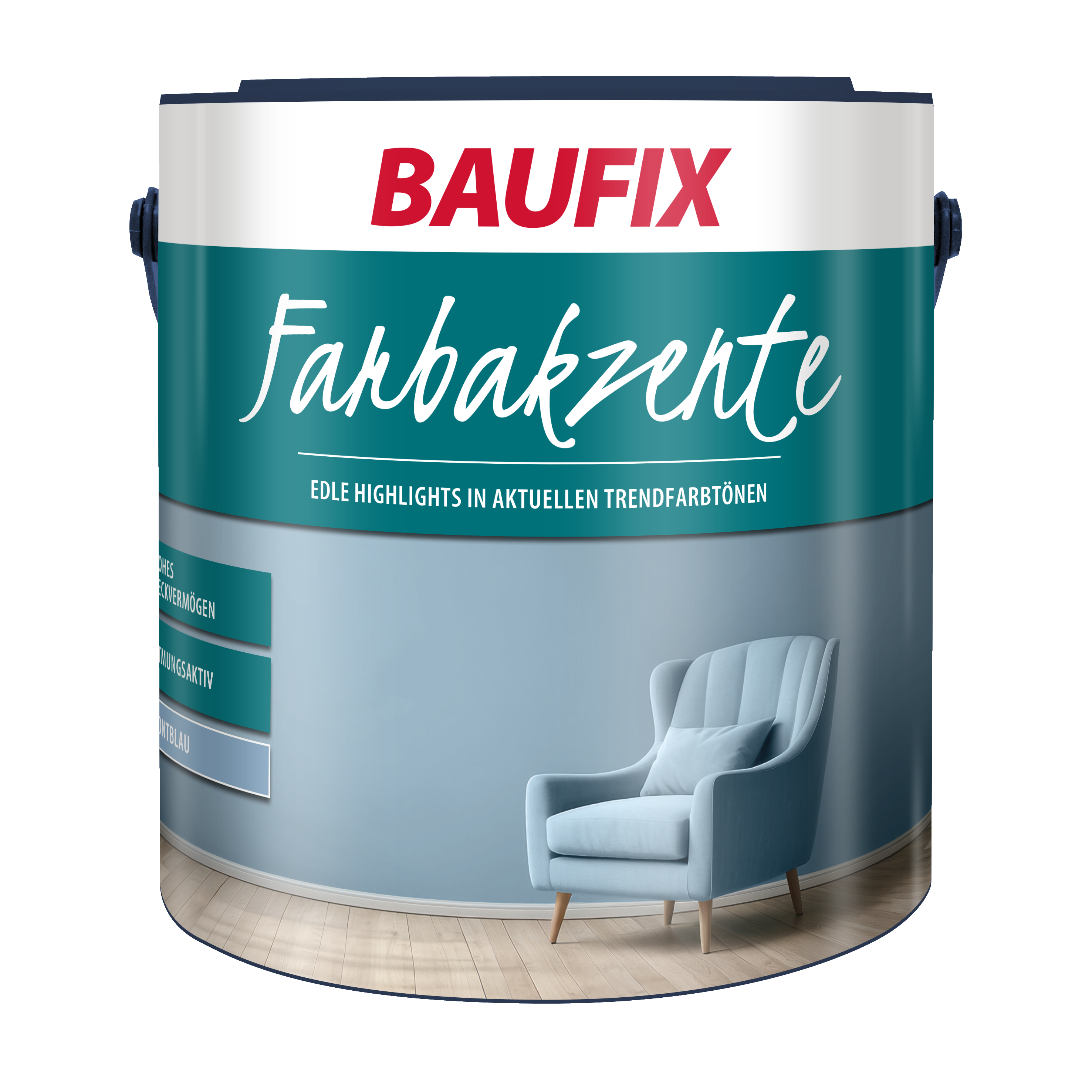
Whether sage green, turquoise, raseda green or fir green - green tones on the walls radiate calm. The natural effect is complemented by wooden furnishings and houseplants. Accessories in shades of blue also have a calming effect. If you combine an additional wall color with shades of green, you should use the same color family or opt for beige, brown or light gray tones.
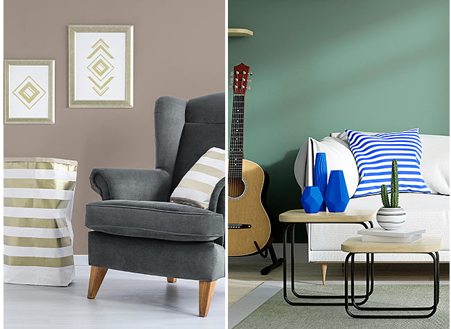
Red accent walls have the property of being particularly invigorating and energizing, but should be used sparingly if you want to create a calm and relaxed atmosphere in your living room and living space. Orange or terracotta are a good alternative to red tones, as they allow for a warmer and more comfortable wall design. Red can be combined with green tones or a shade of gray, which creates liveliness. A wine red on the walls is expressive and gives the room a certain elegance. Partners to intense red tones can be black or even brown tones. The living room gains a certain mystique with this wall color.
Try coziness - the motto from the well-known cartoon can be ideally created with beige or greige (a mixture of grey and beige) as the wall colour on your living room walls. Beige and greige tones are perfect base tones and make great additions when combined with strong or delicate colours. But beige tones also create a homely, secure and comfortable atmosphere on their own. Furniture and decoration can be accentuated in shades of brown or grey.
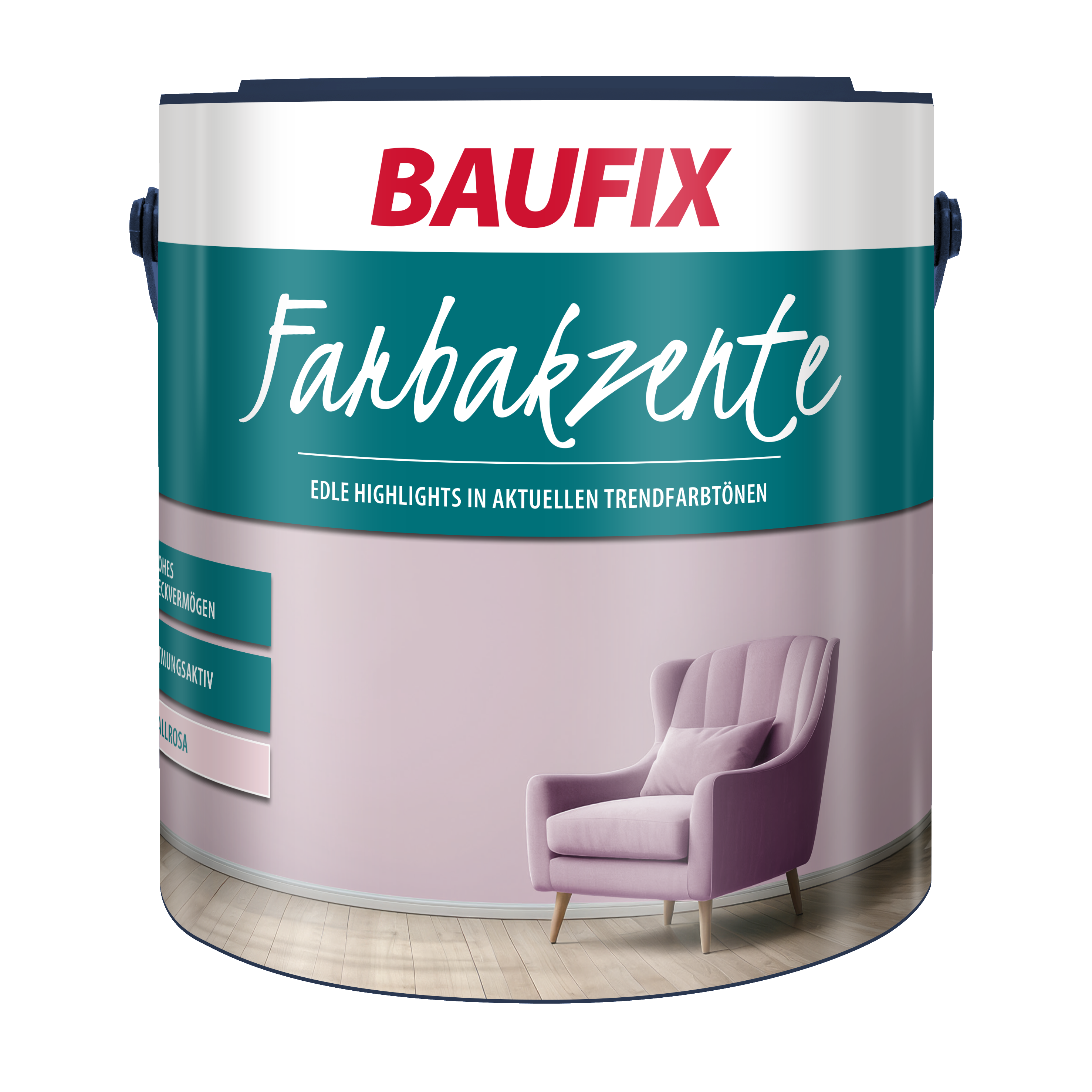
Pastel is a real all-rounder and the color palette as a wall color for the living room is promising. The shades are the perfect wall color for living rooms with little daylight, small windows or furniture that is very dark. The living room gains optical space with these light color nuances and brings a certain lightness. This effect is conjured up by toned trendy colors on the living room walls due to the very high proportion of white. If pure white or other shades of white seem too sterile for you, pastel colors are a good alternative. In contrast to red tones, you can paint the wall surfaces completely with the wall paint, underline them with bright, accentuated light tones or beautify the living room walls with a wall color from the same family. Pastel tones include: mint green, sky blue, pink, lilac and pastel gray.
Our trend colors for modern living rooms
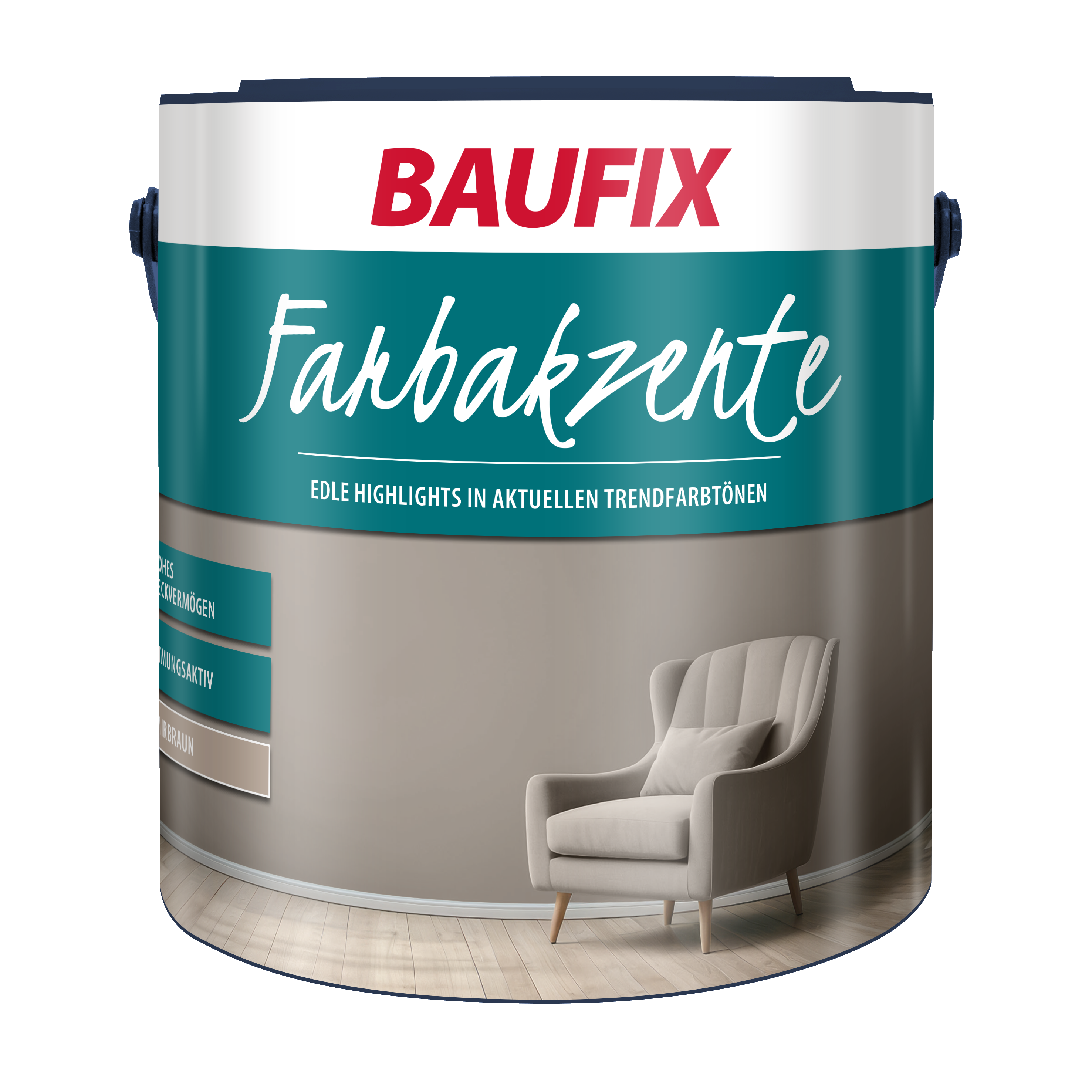
Baufix Color Accents
subheading
Which colors appear friendly, bright, modern and cozy?
When designing walls, many people want an inviting and friendly atmosphere. When designing the room, a warm interior design style should be chosen. Orange, warm reds, beiges and earth tones are well suited for this. You should only combine strong contrasts with this interior design style in moderation, at most on a small area, for example as an accent wall or wall strip. Shades of blue and green bring peace and security. You should also take a look at different shades of gray. Depending on the brightness, gray is particularly effective as a living room wall color and there are no limits to ideas when it comes to personal style in the living room. A recommended color partner for shades of gray is a delicate pink.
subheading
Conclusion - Wall color in the living room
The living room wall color should be entirely in line with your taste. Current trends and color tips will help you to find your way and an interior design style that meets your requirements. That's why we have a large selection of BAUFIX wall paints for the living room that are suitable for both the first coat and for renovation work. Our BAUFIX professional Premium Crystal White is the popular classic, is the perfect interior paint with high coverage and no preservatives. You can achieve modern paint finishes with our BAUFIX color accents. Special colors for kitchens round off our range. Browse through our selection. We will be happy to advise you by phone or email.
subheading
FAQ
FAQ
Frequently Asked Questions
Warm earth tones such as beige, brown and green create a cozy and harmonious atmosphere. Yellow, orange or red bring additional warmth and liveliness to the living room.
Green, as the color of nature, conveys a feeling of calm. It has a balancing effect on the psyche and promotes relaxation.
Tones like deep blue, velvety gray or elegant dark green give your walls a timeless beauty. For a modern look, combine neutral colors like white or beige with accents in precious metals like gold or copper.
subheading
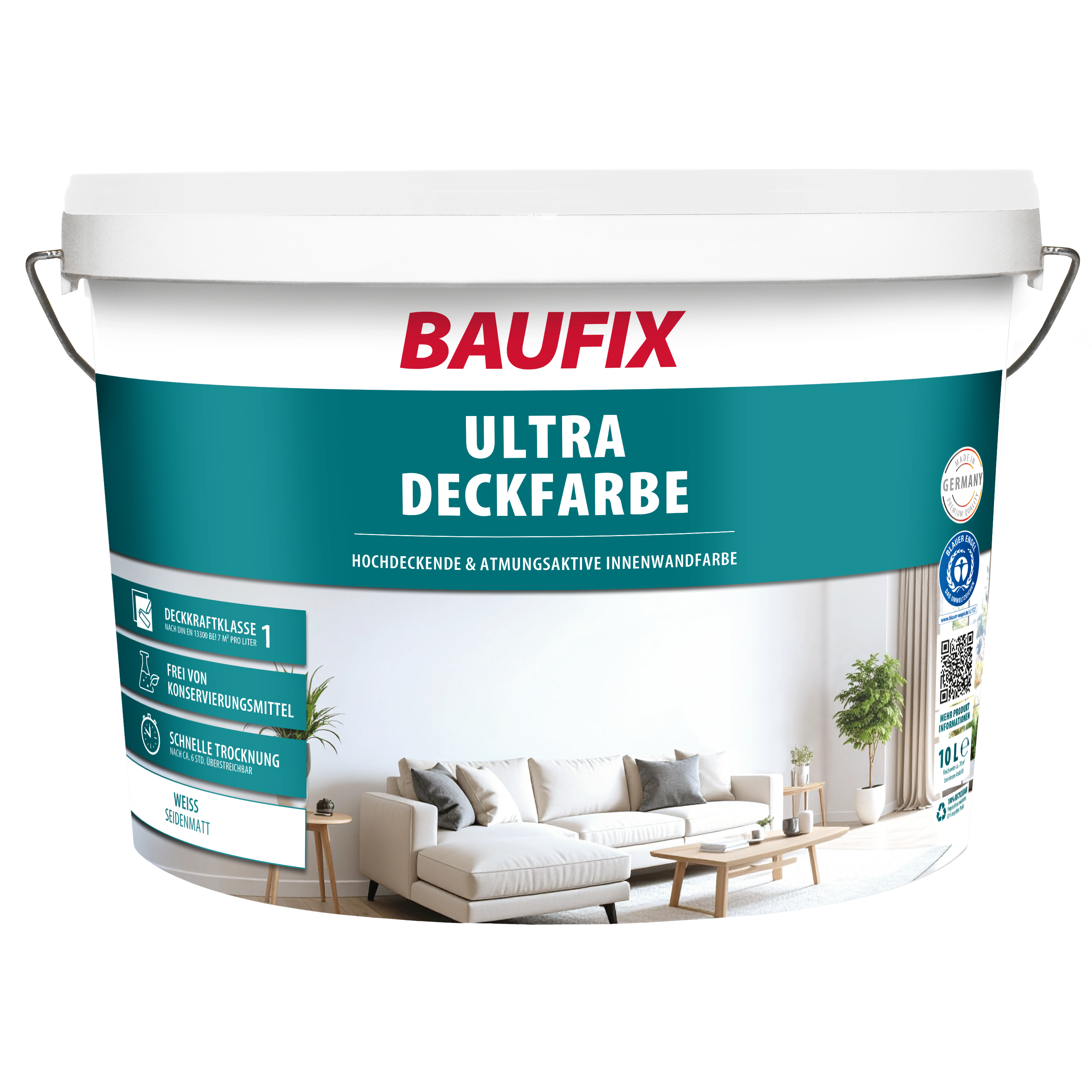
Our wall paint: BAUFIX Ultra-Deckfarbe
- Coverage class I according to DIN EN 13300 at 7 m²/l
- Wet abrasion resistance class III according to DIN EN 13300
- pearl white satin finish
- covers perfectly
- low-emission
- for walls & ceilings indoors
Most popular products
Our bestsellers
More exciting topics in the guide: