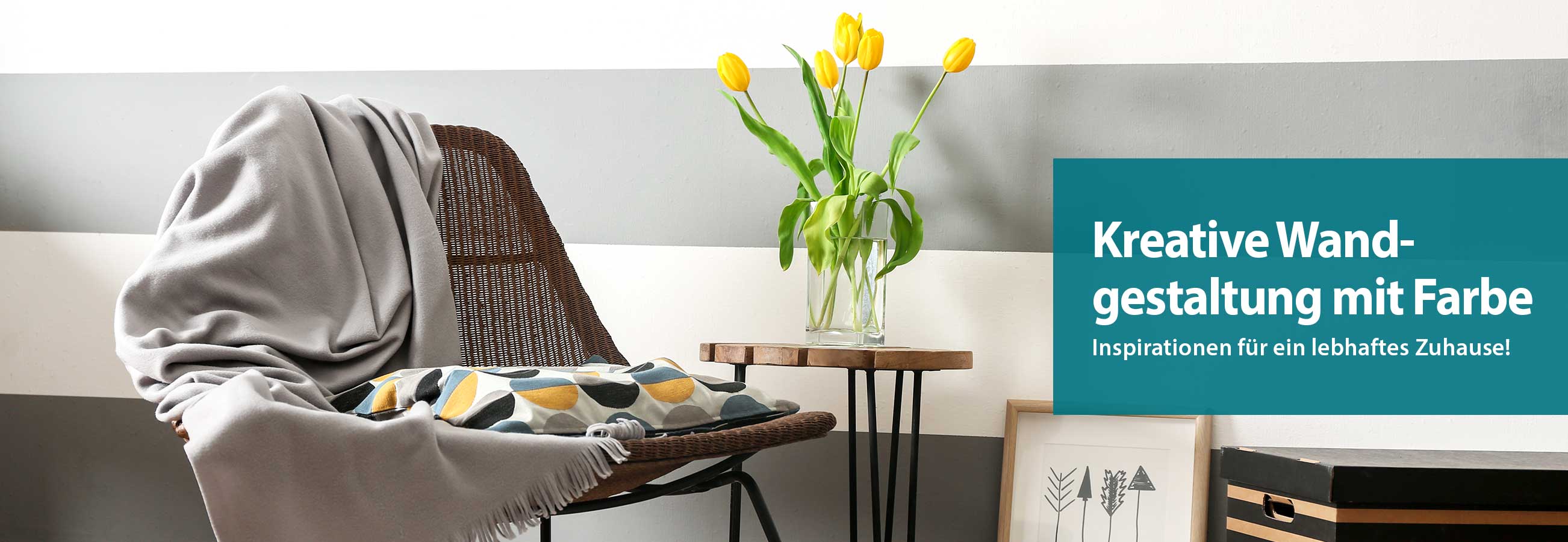
Kreative Wandgestaltung Farbe
Inhalt
Ideen & Tipps für außergewöhnliche Wände - So sorgst Du für eine kreative Wandgestaltung mit Farbe
Drei grundlegende Möglichkeiten der Wandgestaltung mit Farbe
Die richtige Farbwahl für das richtige Zimmer
Farbkonzepte erstellen mit dem Farbkreis
Wandgestaltung mit Farbe: Farbkombinationen und ihre Raumwirkung
Kreative Wandgestaltung mit Farbe: Diese Looks sind in
Kreative Wandgestaltung mit Farbe und Deko: Erwecke Dein Zuhause mit Special Effects zum Leben
Ideen & Tipps für außergewöhnliche Wände – So sorgst Du für eine kreative Wandgestaltung mit Farbe
Du bist gelangweilt von Raufaser-Tapete und weißer Hintergrundfarbe? Du hast Lust auf Veränderung und suchst noch nach der nötigen Inspiration? Dann könnte die kreative Wandgestaltung mit Farbe genau das Richtige für Dich sein! Mit Wandfarben hast Du zahlreiche Möglichkeiten, um für pfiffige Hingucker, optische Highlights und harmonische
Akzente zu sorgen. Ob im Wohnzimmer, Schlafzimmer, Kinderzimmer oder Esszimmer, wir verraten Dir in diesem Ratgeber, wie Du mit Anstrich, Farbkombinationen, Wandtattoos und Co. erfrischend neue Looks kreierst.
Drei grundlegende Möglichkeiten der Wandgestaltung mit Farbe
Einfarbige Wände: Dies ist die einfachste und klassischste Methode der Wandgestaltung mit Farbe. Eine einfarbige Wand schafft eine saubere und einheitliche Optik, die leicht zu pflegen ist und als perfekte Kulisse für Möbel und Dekorationen dient.
Akzentwände: Bei dieser Methode der Wandgestaltung mit Farbe wird nur eine Wand oder ein Teil einer Wand in einer auffälligen Farbe gestrichen, während die restlichen Wände neutral bleiben. Eine Akzentwand zieht die Blicke auf sich und kann einen Raum dynamischer und interessanter machen.
Mustergestaltung und Techniken:Hierbei werden verschiedene Maltechniken oder Muster angewendet, um der Wand Textur und Tiefe zu verleihen. Dies kann durch Streifen, Farbverläufe (Ombré), geometrische Muster oder kreative Maltechniken wie Tupfen oder Schwammtechnik erreicht werden.
Die richtige Farbwahl für das richtige Zimmer
Die Farbwahl bei der kreativen Wandgestaltung solltest Du entsprechend der Zimmer abstimmen:
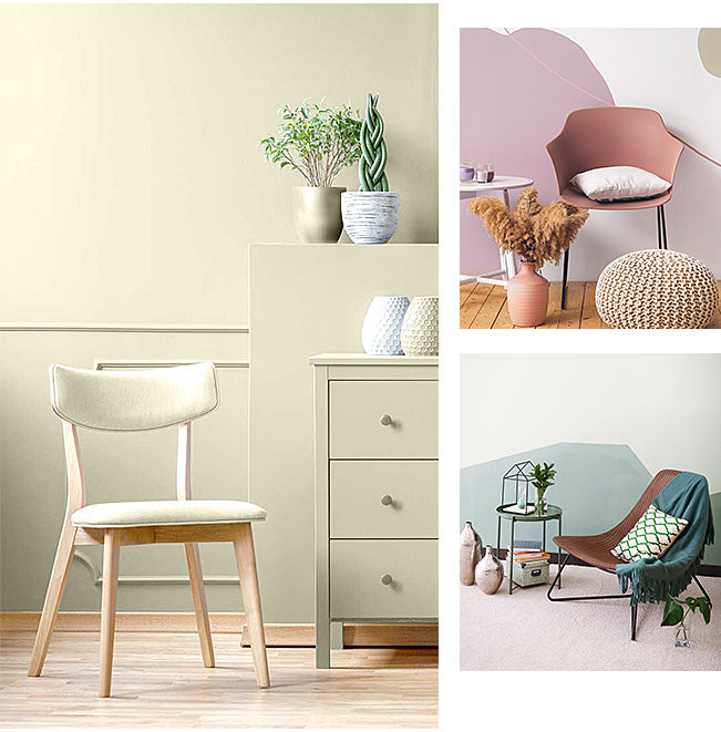
In einem Wohnzimmer schaffen helle Farbtöne und Pastelltöne eine offene und einladende Optik. Mit Möbeln setzt Du spannende Kontraste. Grundsätzlich gilt, dass helle Anstriche kleine Räume an Weite gewinnen lassen. Mit dunkleren Tönen verleihst Du einem Raum Ausdruckskraft. Das kann jedoch schnell drückend wirken. Setze in dem Fall auf helle Deckenfarben.
In Küche und Essbereich sind aufheiternde, luftige Farben eine gute Wahl. Durch kreative Wandgestaltung mit Farbe setzt Du farbenfrohe Hingucker. Von Gelbtönen über Orange bis Grün ist in der Küche alles erlaubt.
Im Schlafzimmer helfen warme, satte Nuancen, die nötige Ruhe und Behaglichkeit zu schaffen und mittels kreativer Wandgestaltung mit Farbe dezent für Abwechslung zu sorgen.
In Bädern bringen Farben wie Blau oder Grün einen natürlichen Look. Achte hier auf die Nutzung Anti-Schimmel-Farbe, Kalkfarbe, Latexfarbe oder Silikatfarbe. Diese verhindern, dass Feuchtigkeit in den Wänden zu Schimmelbildung führt.
Im Kinderzimmer kannst Du in Sachen Wandfarbe, Farbgestaltung und der kreativen Wandgestaltung mit Farbe in die Vollen gehen. Ob bunte Farben, die Lieblingsfarbe Deines Kindes, Motivtapeten oder Wandtattoos – die Raumgestaltung darf verspielt sein.
Farbkonzepte erstellen mit dem Farbkreis
Der Farbkreis ist ein grafisches Hilfsmittel für eine gelungene Wandgestaltung mit Farbe, das die Beziehung zwischen verschiedenen Farben veranschaulicht. Er besteht aus zwölf Farben, die in einem Kreis angeordnet sind und in Primär-, Sekundär- und Tertiärfarben unterteilt werden:
Primärfarben:
Rot, Blau, Gelb - Diese Farben sind die Grundbausteine und lassen sich nicht durch das Mischen anderer Farben herstellen.
Sekundärfarben:
Grün Orange, Violett - Diese entstehen durch Mischen von zwei Primärfarben.
Tertiärfarben:
Rot-Orange, Gelb-Grün und Co. - Diese Farben entstehen durch das Mischen einer Primärfarbe mit einer angrenzenden Sekundärfarbe.
Der Farbkreis hilft dabei, harmonische Farbkombinationen zu finden, wie Komplementärfarben (gegenüberliegend im Kreis), analoge Farben (nebeneinander) und triadische Farben (gleichmäßig verteilt). Hast Du Dich auf Grundtöne festgelegt, kannst Du Dir einen Überblick über mögliche Farbnuancen verschaffen. Hier hilft ein Blick auf eine Farbtabelle, in der sämtliche Farben mit den dazugehörigen Farbcodes hinterlegt sind.
Wandgestaltung mit Farbe; Farbkombinationen und ihre Raumwirkung
1. Farben zwischen zwei Grundfarben
Diese Farben schaffen weiche Übergänge und wirken beruhigend. Grün- und Blautöne erinnern an Natur und Wasser, vermitteln Ruhe und Frische. Rot- und Orangetöne strahlen Wärme und Energie aus. Diese Raumwirkung ist ideal für Wohn- und Essbereiche.
2. Analoge Farben
Analoge Zimmerfarben teilen ähnliche Nuancen und wirken harmonisch. Gelb und Orange erzeugen eine warme, einladende Atmosphäre, perfekt für Küchen und Esszimmer. Blau und Violett wirken beruhigend und luxuriös, ideal für Schlafzimmer und Wohnzimmer.
3. Komplementärfarben
Komplementärfarben bieten starken Kontrast und Dynamik. Rot und Grün sind kräftig und auffällig, oft in der Weihnachtsdekoration verwendet. Blau und Orange haben eine energetische, fröhliche Wirkung, ideal für die Wandgestaltung mit Farbe für kreative Räume.
4. Tradische Farben
Triadische Farben bieten ausgewogenen Kontrast. Rot, Blau und Gelb sind lebhaft und fröhlich, ideal für Kinderzimmer und kreative Arbeitsbereiche. Grün, Orange und Violett wirken bunt und dynamisch, gut für moderne Raumgestaltungen.
Wirkungen der Farbkombinationen
Beruhigende und entspannende Tonalität: Blau- und Grüntöne sowie analoge Kombinationen wie Blau und Violett schaffen ruhige Umgebungen.
Energisch und lebendig: Komplementär- und triadische Kombinationen wie Rot und Grün erzeugen lebendige Atmosphären.
Wärme und Gemütlichkeit: Warme Farben wie Gelb, Orange und Rot haben eine einladende Raumwirkung, ideal für soziale Bereiche.
Kreative Wandgestaltung mit Farbe: Diese Looks sind in
Bei der Entscheidung, welche kreative Wandgestaltung mit Farbe für dich infrage kommt, kann ein Blick auf die aktuellen Trends helfen. Der aktuelle Trend sind warme, erdige Nuancen. Im Gegensatz dazu kannst Du bei der kreativen Wandgestaltung die gesamte Farbpalette nutzen. Lasse Dich von den nachfolgenden Farbideen für Dein Projekt inspirieren.
Ein absoluter Hingucker sind Farbakzente auf der Wand mit Streifen. Diese trendigen Elemente können in unterschiedlichen Farben und Breiten gestaltet werden. Mittels Klebestreifen ist die Umsetzung besonders einfach.
Mit Farbflächen in Kontrast- oder Effektfarben setzt Du einen geschickten Rahmen oder eine formschöne Umrandung für beispielsweise Bilder. Hierfür musst Du die Fläche mit Klebeband abkleben, den Anstrich auftragen und nach dem Trocknen das Kreppband entfernen.
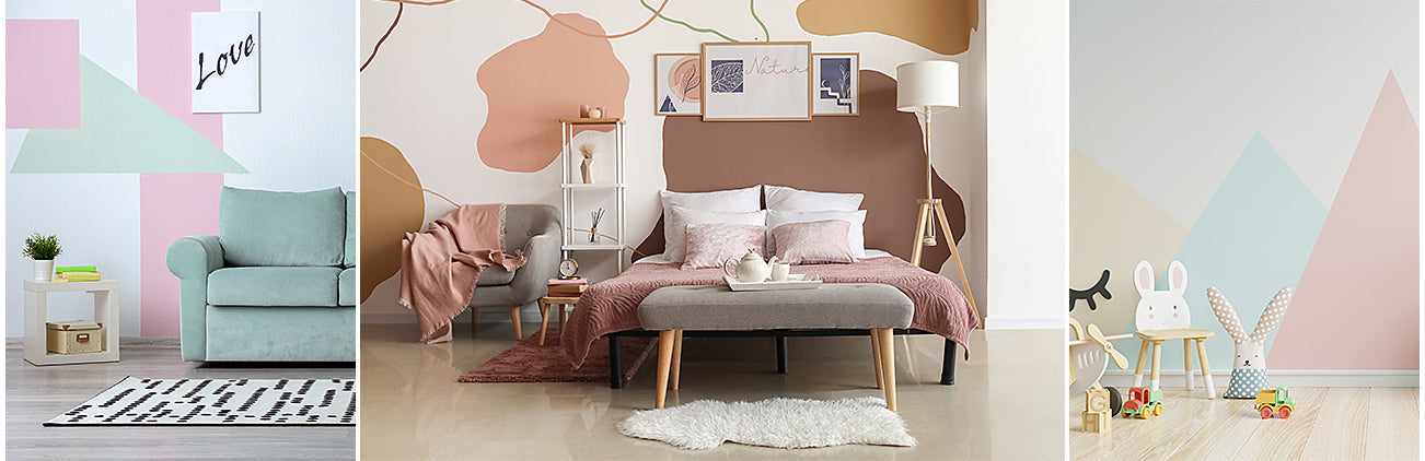
Rauten, Kreise, Quadrate, Dreiecke – an die Wand kommt dieses Jahr eine ganze Menge Geometrie, die optisch für Struktur sorgt. Im Flur, der Küche oder dem Badezimmer kommen die Formen der kreativen Wandgestaltung mit Farbe besonders gut zur Geltung und lassen sich mit vorgefertigten Schablonen, Wandfarbe und Pinsel exakt anstreichen.
Einen 3D-Effekt bei der kreativen Wandgestaltung mit Farbe zu kreieren, ist nicht ganz so einfach. Wichtig ist hierbei ein absolut exaktes Vorgehen, damit sich am Ende auch der gewünschte 3D-Effekt zeigt.
Farbkombinationen wirken einer tristen Eintönigkeit entgegen. Du kannst auf Wandfarben in unterschiedlichen Nuancen aus einer Farbfamilie in kräftigen Tönen oder mehrfarbigen Kombinationen in Pastell zurückgreifen.
Oder setze statt Farbe auf eine Betonoptik. Mit der richtigen Effekt-Farbe und ein wenig handwerklichem Geschick ist diese leicht nachzuahmen. Ebenso charmant zeigt sich der Industrie-Look mit nacktem Putz.
Farbverläufe von unten nach oben sind ein eleganter Kompromiss, wenn Du eine Wand bei der Renovierung nicht komplett streichen, aber auch nicht nur vereinzelte farbige Punkte setzen willst. Von unten nach oben wird die Farben dabei immer heller gestrichen.
Gestrichene Holzpaneele, Vertäfelungen und Türen schaffen einen tollen Kontrast zu Böden und lassen das Gesamtbild leichter und fröhlicher wirken. Du hast die Möglichkeit, die einzelnen Paneele in unterschiedlichen, dezenten Farben oder einer kräftigeren Farbe zu streichen. Für das Streichen von Holz eignet sich am besten Kreidefarbe.
Kreative Wandgestaltung mit Farbe und Deko: Erwecke Dein Zuhause mit Special Effects zum Leben
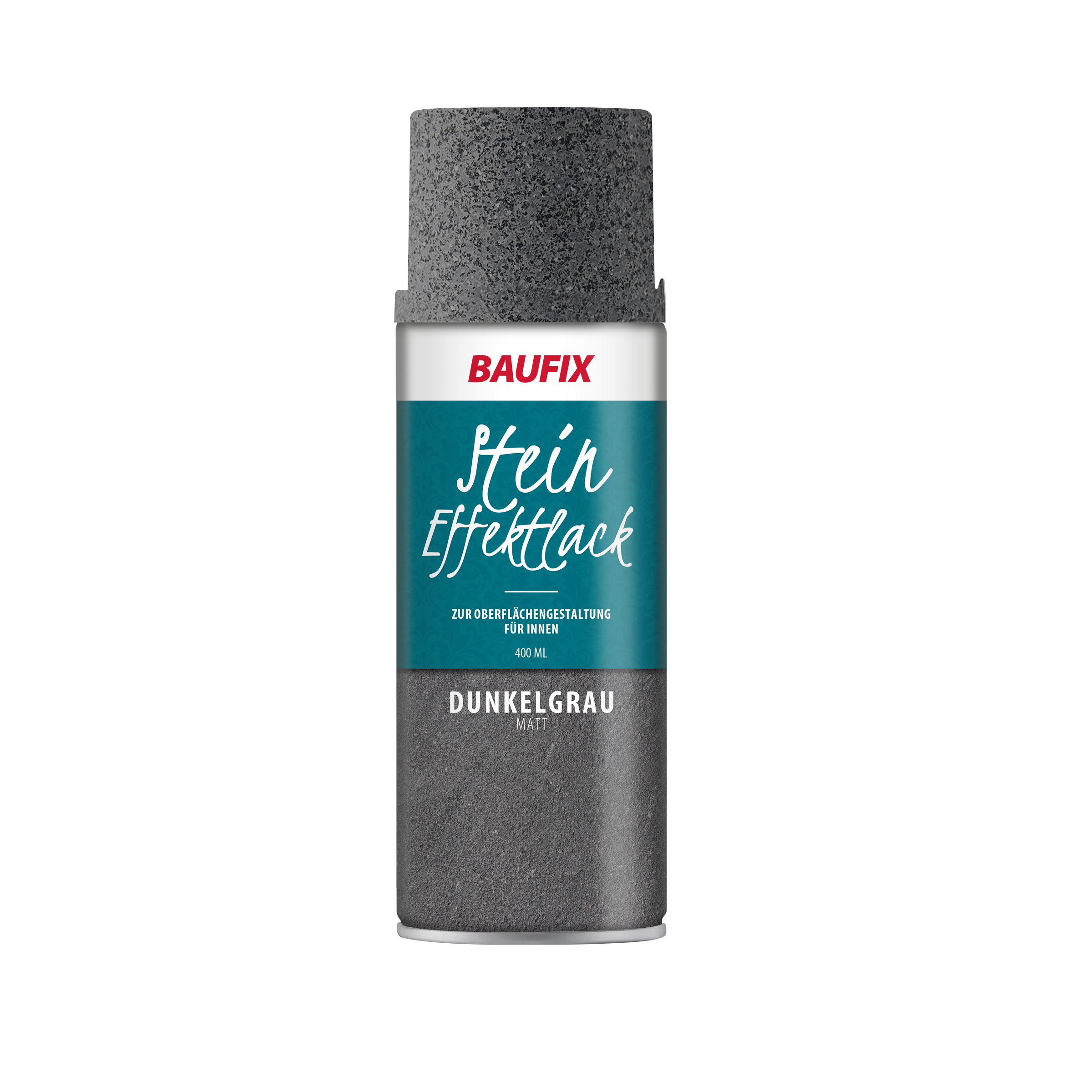
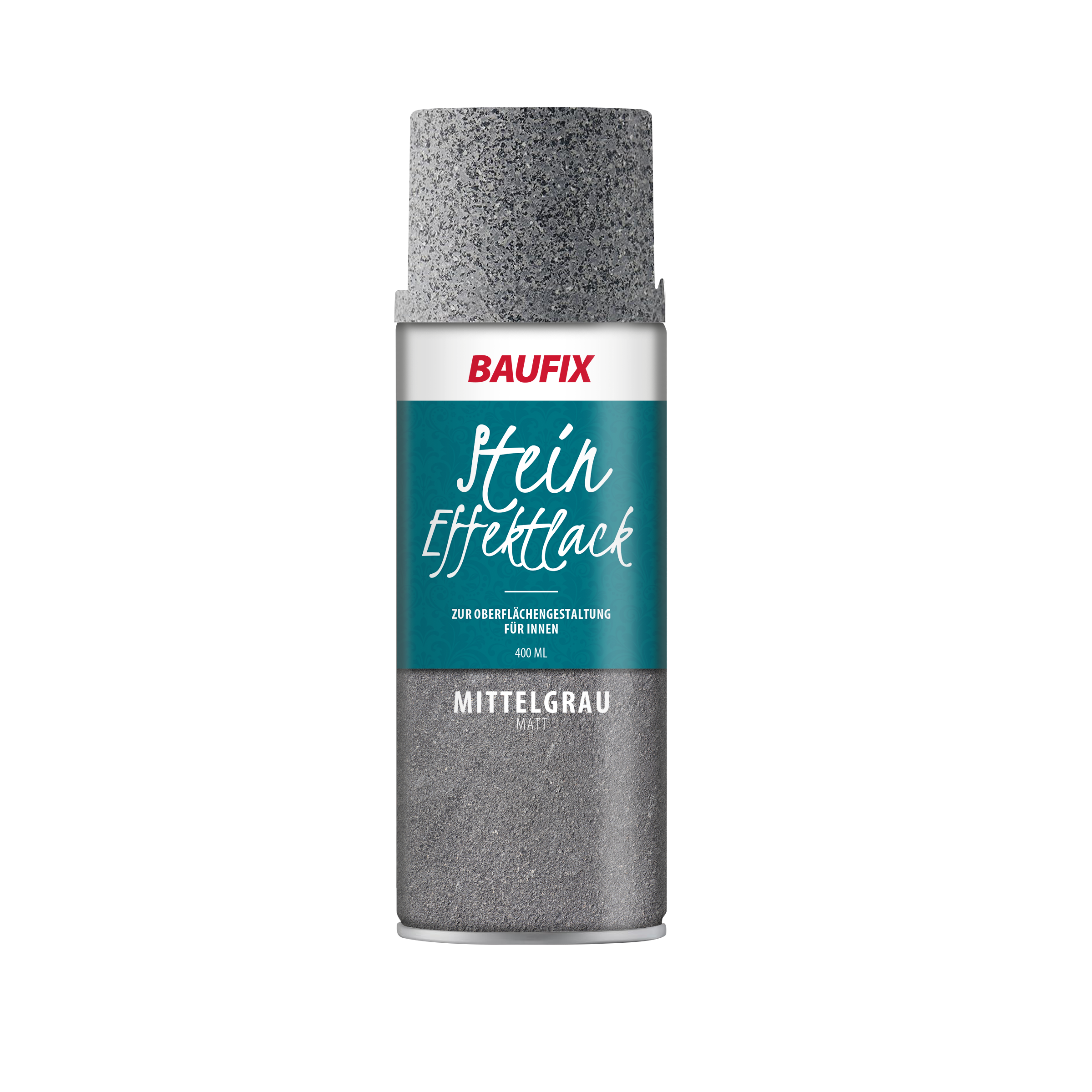
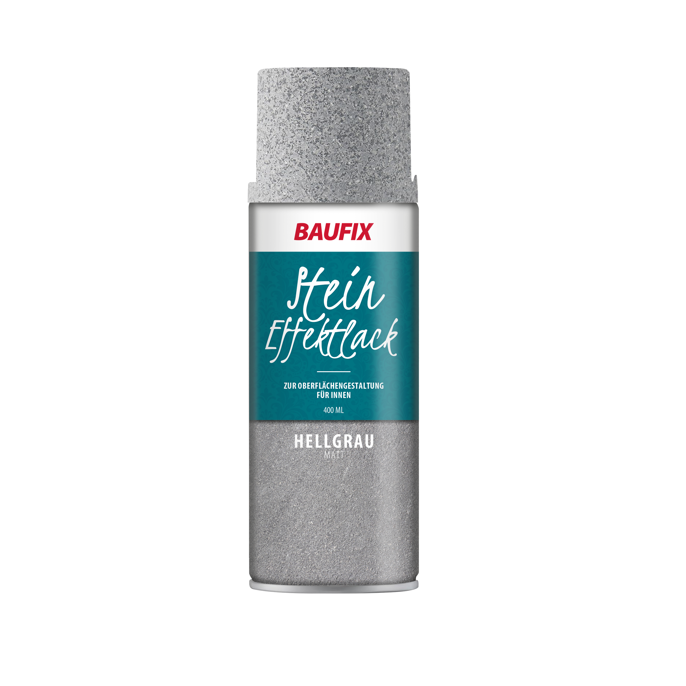
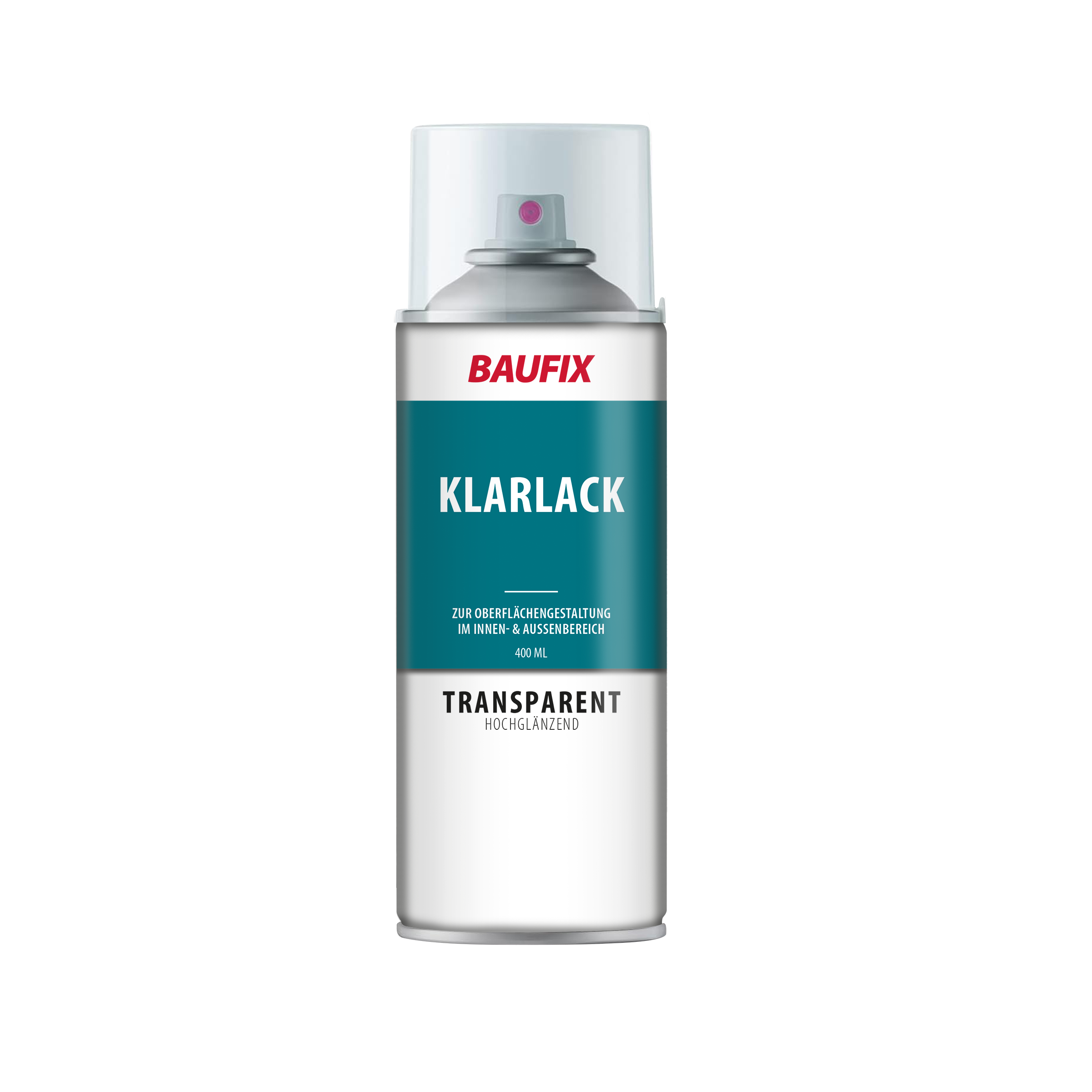
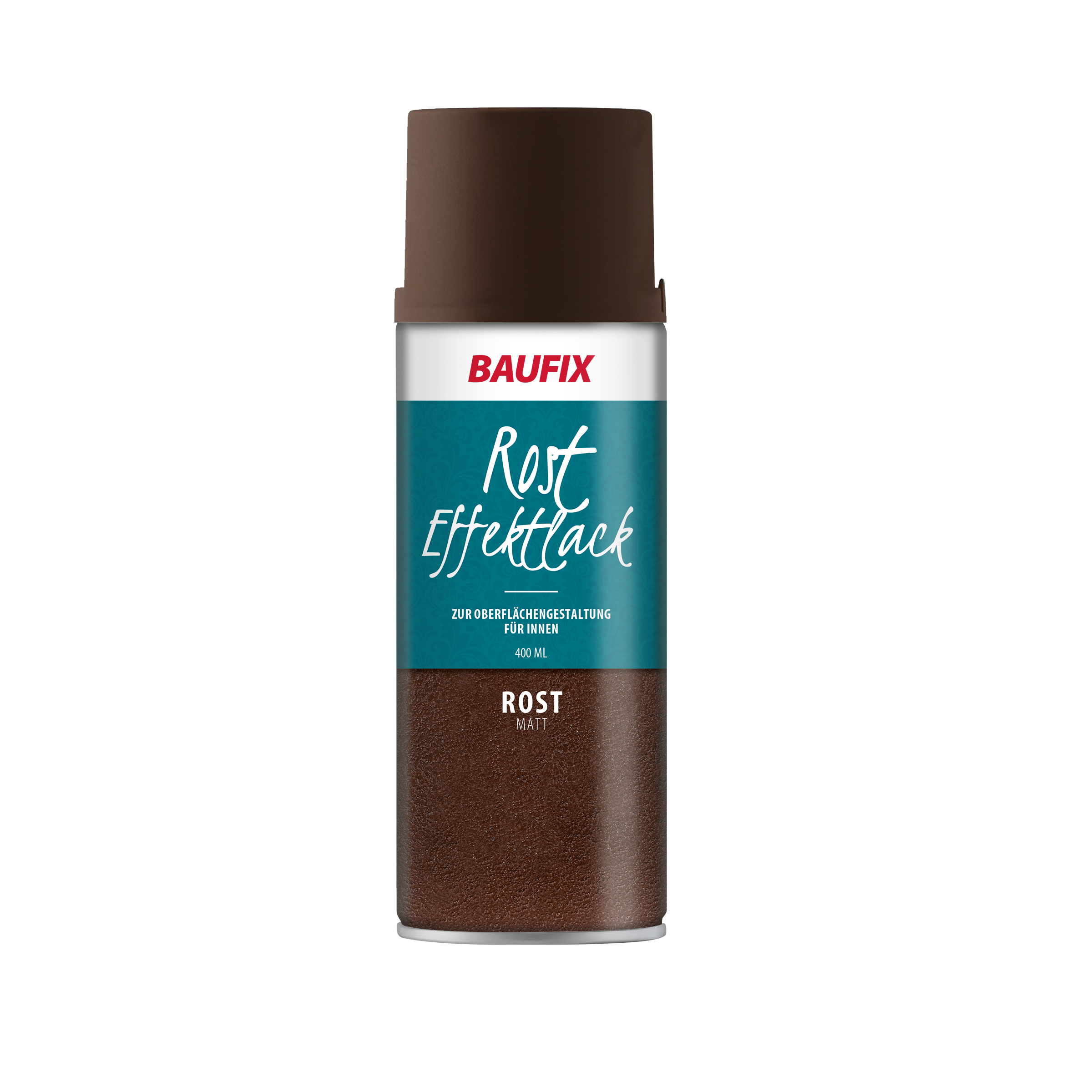
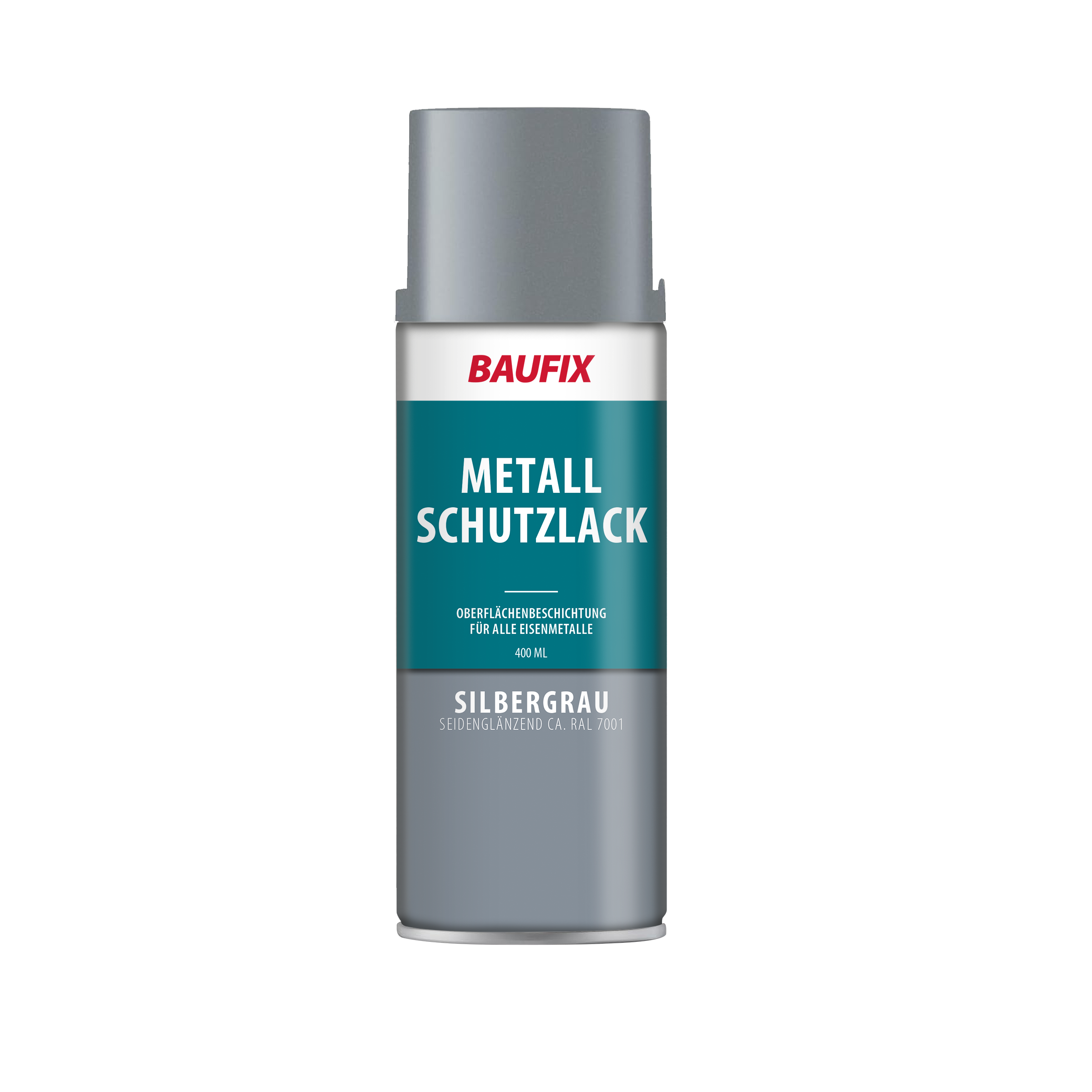
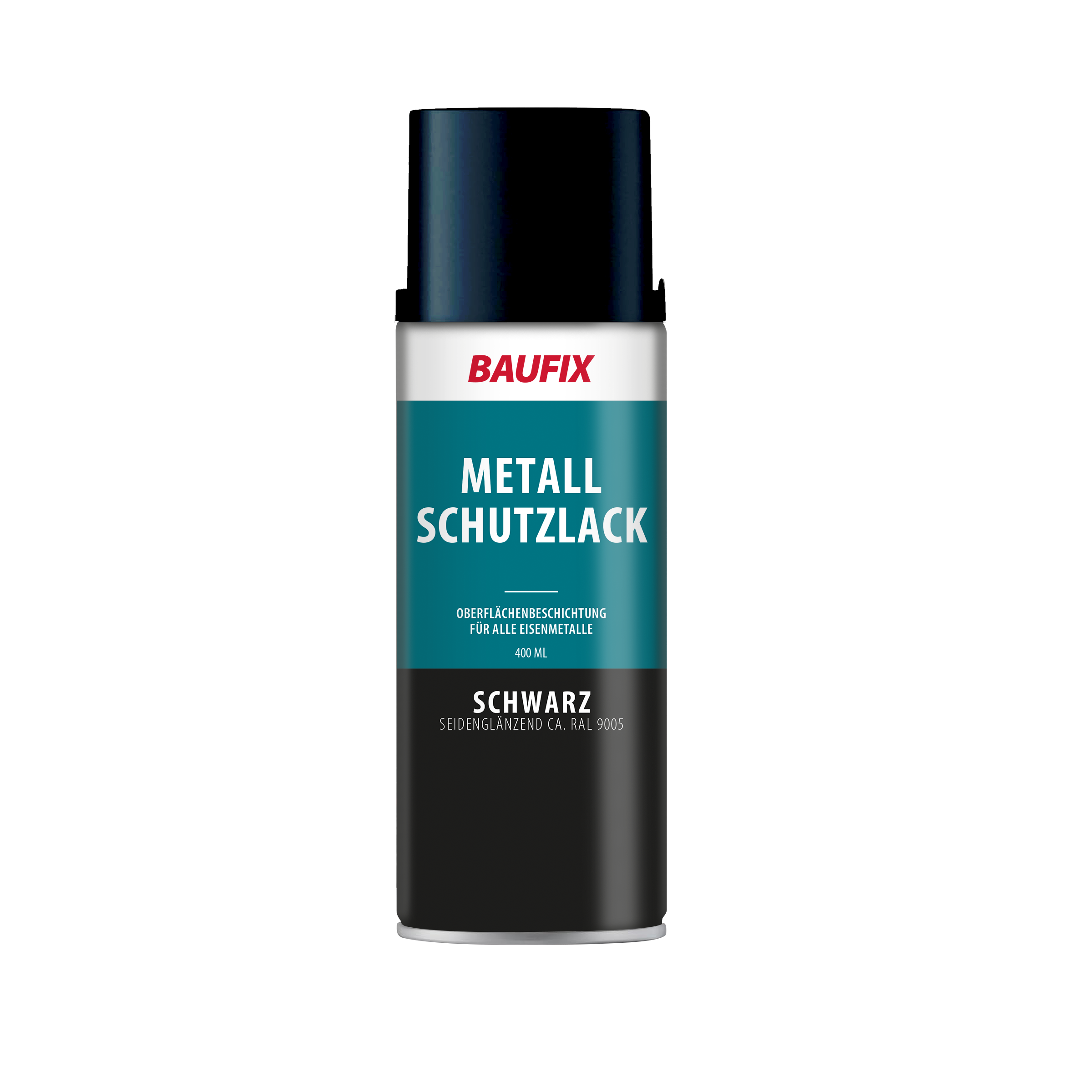
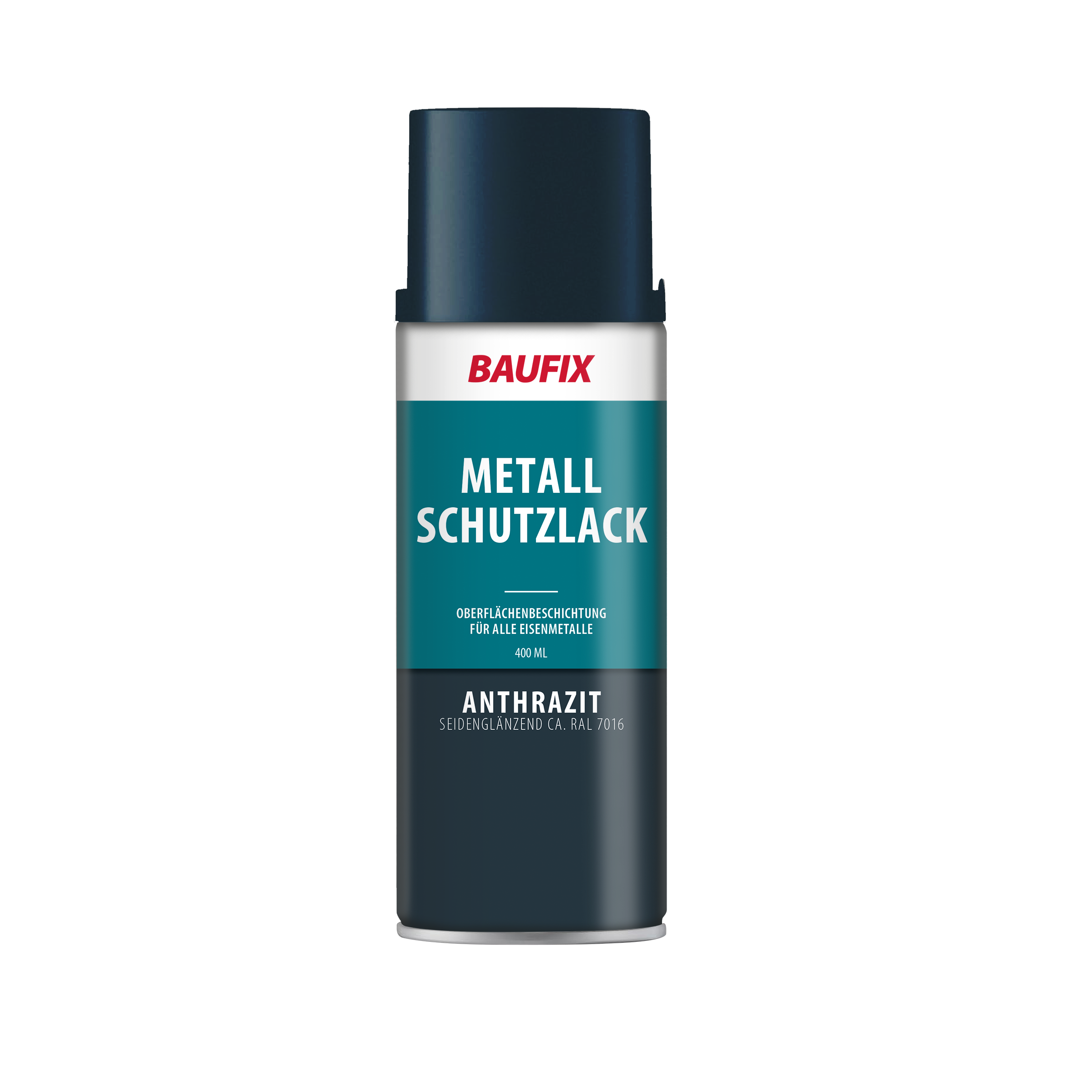
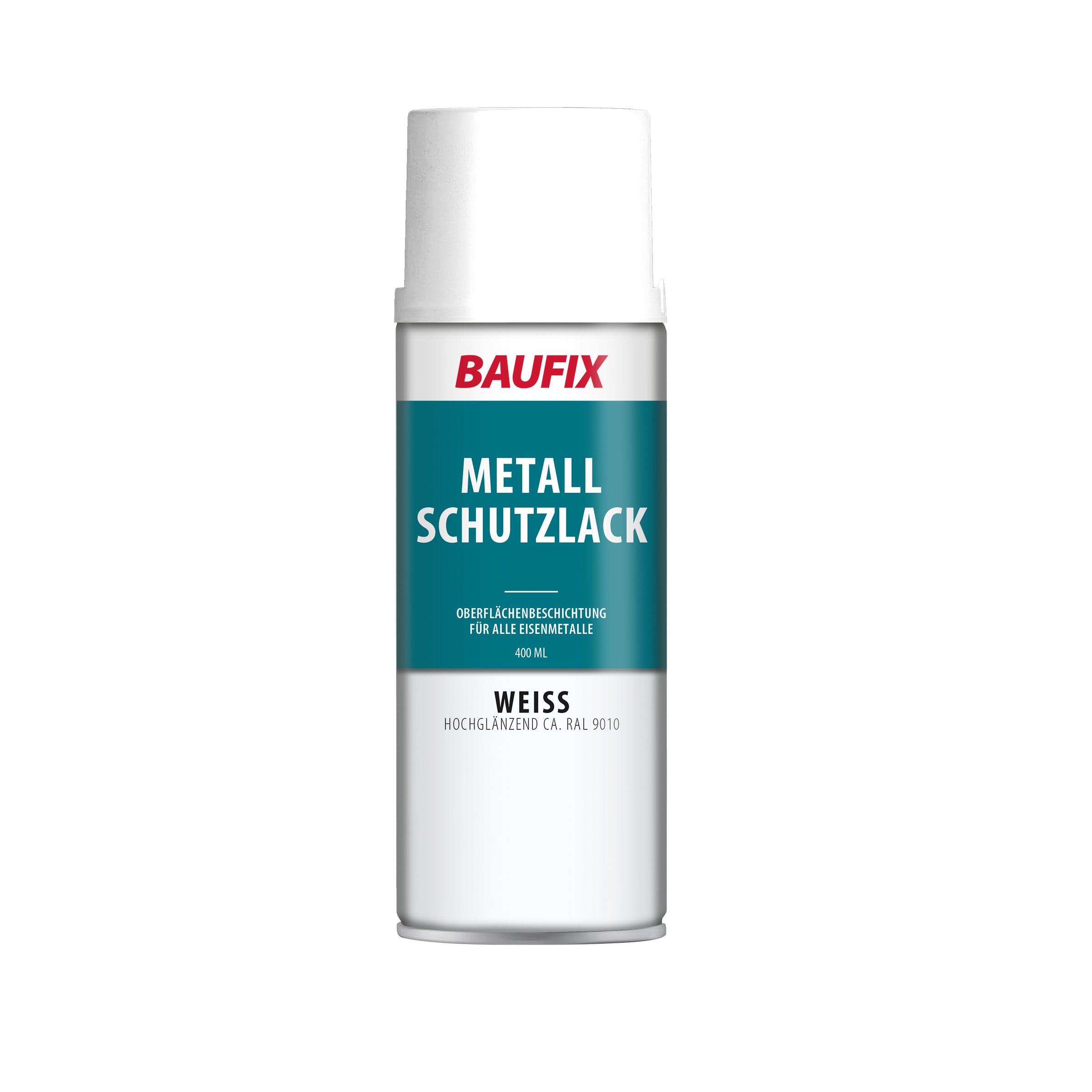
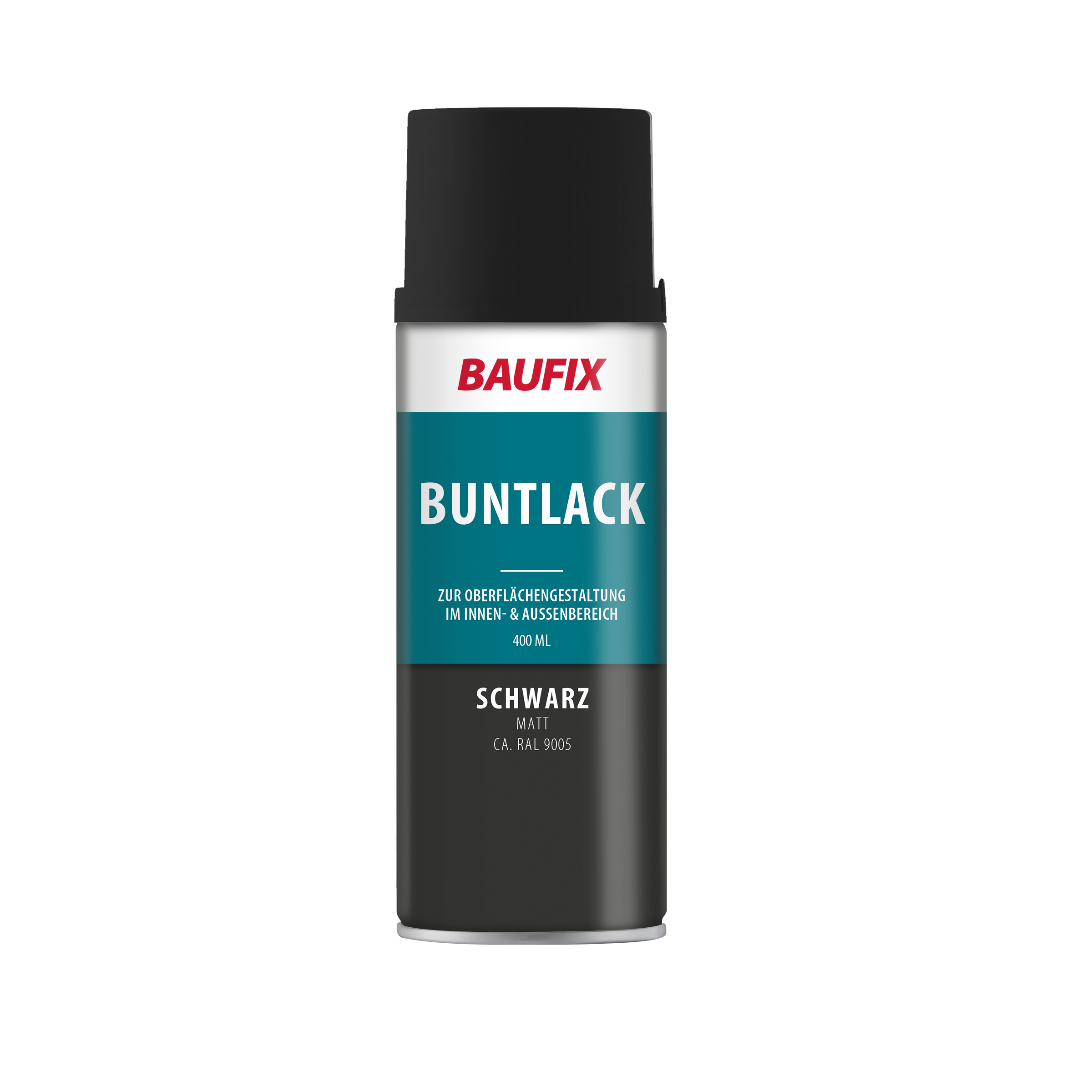
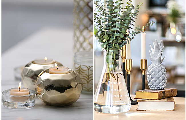
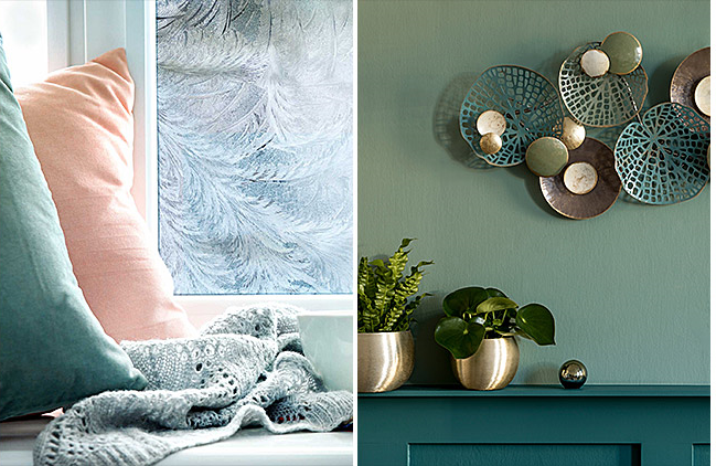
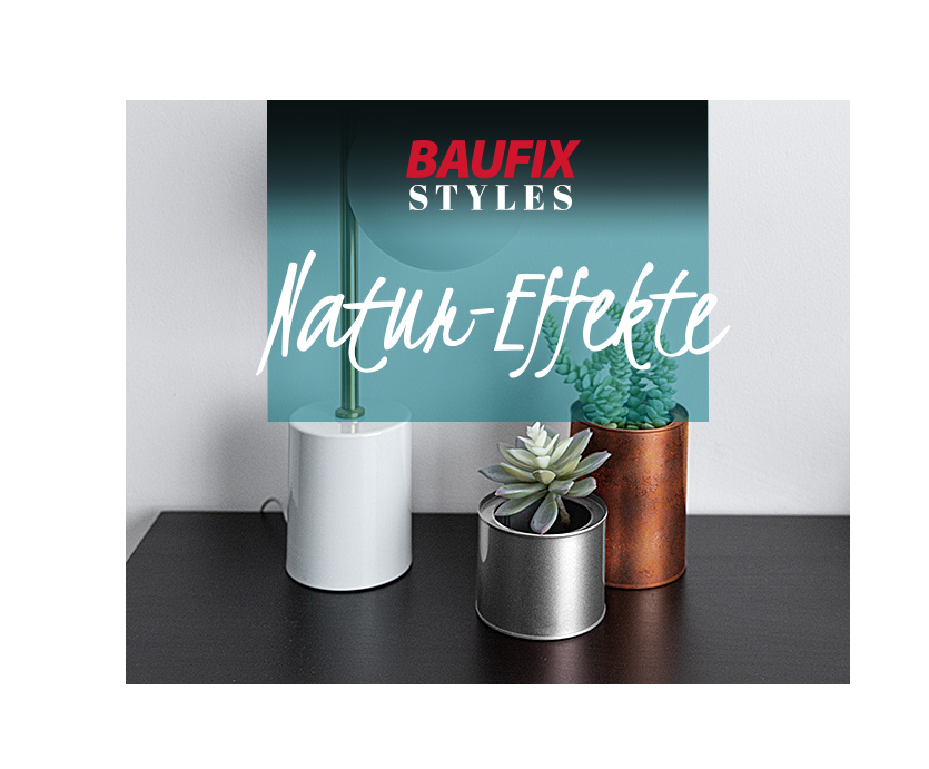
Als Begleiter zur kreativen Wandgestaltung mit Farbe eignet sich zum Beispiel unsere BAUFIX Styles Farbakzente. Es erwarten Dich sechs unterschiedliche Töne. Aber nicht nur Wände schaffen Special Effects in Ihren Räumlichkeiten. Vasen, Dekoelementen, Schalen und selbst Fenster lassen sich fantasievoll, elegant und raffiniert optisch aufwerten. Dazu passend findest Du bei uns die BAUFIX Styles Effektlacke. Verleihe Oberflächen wie Metall, Holz, Kunststoff, Glas und Stein mit unserem BAUFIX Styles Chrom-Effektlack, BAUFIX Styles Glanz- oder Goldlack, BAUFIX Styles Rost-Effektlack oder BAUFIX Styles Stein-Effektlack eine besondere Note.
Schaue Dich gerne in unserer Auswahl um. Bei Fragen oder dem Wunsch einer Beratung setze dich gerne telefonisch oder per E-Mail mit uns in Verbindung.
Häufige Fragen zur Wandgestaltung mit Farbe
Welche Farbe streicht man am besten farbig?
Welche Wand Du am besten farbig streichen solltest, hängt von der gewünschten Raumwirkung ab. Möchtest Du einen langgestreckten Raum optisch verkürzen, streiche die beiden Stirnseiten in einer dunkleren Farbe als die anderen Wände. Dies schafft die Illusion von mehr Tiefe und lässt den Innenraum kürzer und gemütlicher wirken.
Wie wählt man die richtige Wand für Akzente aus?
Wähle eine Wand, die Du hervorheben möchtest, wie die Wand hinter dem Sofa im Wohnzimmer oder die Wand hinter dem Bett im Schlafzimmer. Diese Wände ziehen Aufmerksamkeit auf sich und verleihen dem Raum Charakter.
Wie kann man durch farbige Wandgestaltung eine warme und gemütliche Atmosphäre schaffen?
Verwende warme Farben wie Rot, Orange oder Gelb. Diese Farben strahlen Wärme aus und sind perfekt für Wohn- und Esszimmer, da sie eine gesellige und einladende Atmosphäre schaffen.
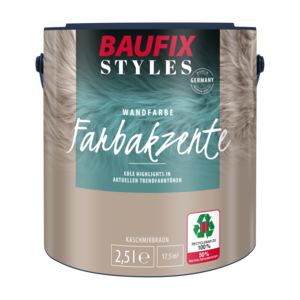
Unsere Wandfarbe:BAUFIX STYLES Farbakzente
Eine Dispersionsfarbe zur farbigen Wandgestaltung in aktuellen Trendfarbtönen. Alle Farbtöne sind gebrauchsfertig, untereinander mischbar, lichtecht und farbkräftig.
- edle Higlights in aktuellen Trednfarbtönen
- für Wände und Decken
- lichtecht, strapazierfähig, deckfähig, nassabriebbeständig
- Farbtöne sind gebrauchsfertig und untereinander mischbar